---
title: "GLMs"
---
## Dataset
We'll use the `DoctorVisits` dataset from the AER package, based on the Australian Health Survey. This dataset includes:
- **visits**: Number of doctor consultations (outcome variable)
- **gender**: Male or Female
- **age**: Age in years (divided by 100 in raw data)
- **income**: Annual income in tens of thousands
- **illness**: Number of illnesses in past 2 weeks
- **health**: Self-assessed health score (0-12, higher values = better health)
- **nchronic**: Chronic condition indicator (no/yes)
- **private**: Private health insurance indicator (no/yes)
This is real survey data from 5,190 individuals in Australia.
## Setup
```{r setup}
#| label: setup
library(tidyverse)
library(MASS)
library(pscl)
library(AER)
library(ggpubr)
library(patchwork)
library(broom)
library(knitr)
library(gridExtra)
theme_set(theme_minimal(base_size = 12))
```
## Data Loading and Preparation
```{r load-data}
#| label: load-data
data("DoctorVisits", package = "AER")

health_data <- DoctorVisits %>%
  mutate(
    age_years = age * 100,
    income_k = income * 10,
    private_insurance = factor(private, levels = c("no", "yes"), labels = c("No", "Yes")),
    chronic_condition = factor(nchronic, levels = c("no", "yes"), labels = c("No", "Yes"))
  ) %>%
  dplyr::select(
    visits,              # Outcome: number of doctor visits
    gender,              # Gender
    age_years,           # Age in years
    income_k,            # Income in thousands
    illness,             # Recent illnesses
    health,              # Self-assessed health score (0-12, higher = better)
    chronic_condition,   # Has chronic condition
    private_insurance    # Private insurance
  )

head(health_data) %>% kable()
```
```{r}
cat("Sample size:", nrow(health_data), "individuals\n\n")
summary(health_data)
```
## EDA
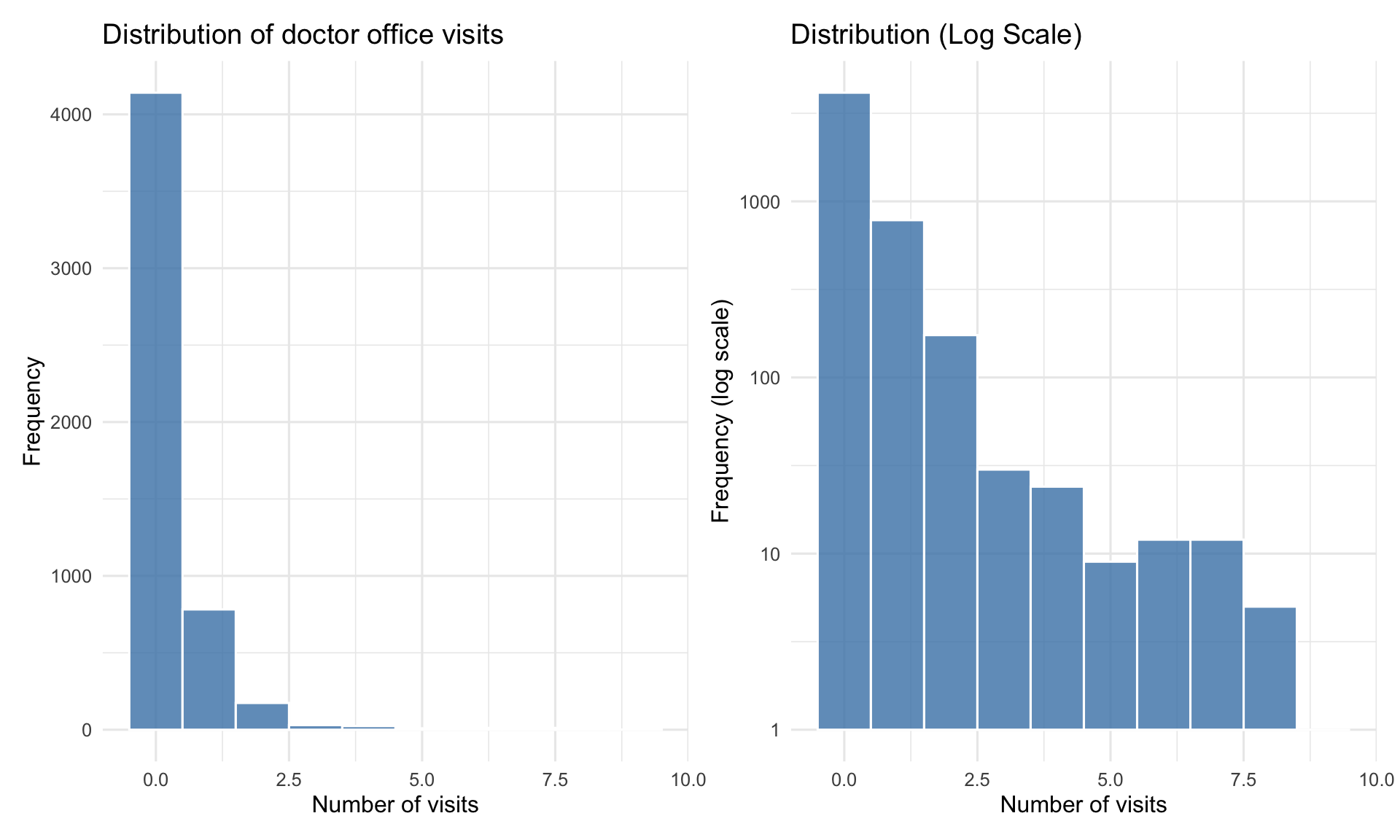
```{r eda-distribution}
#| label: fig-visits-distribution
#| fig-cap: "Distribution of doctor visits is highly right-skewed"
#| fig-width: 10
#| fig-height: 6
p1 <- ggplot(health_data, aes(x = visits)) +
  geom_histogram(binwidth = 1, fill = "steelblue", color = "white", alpha = 0.8) +
  labs(title = "Distribution of doctor office visits",
       x = "Number of visits",
       y = "Frequency") +
  theme_minimal(base_size = 12)

p2 <- ggplot(health_data, aes(x = visits)) +
  geom_histogram(binwidth = 1, fill = "steelblue", color = "white", alpha = 0.8) +
  scale_y_log10() +
  labs(title = "Distribution (Log Scale)",
       x = "Number of visits",
       y = "Frequency (log scale)") +
  theme_minimal(base_size = 12)

p1 + p2
```
```{r descriptive-stats}
#| label: tbl-descriptive
#| tbl-cap: "Descriptive statistics for office visits"
desc_stats <- health_data %>%
  summarise(
    Mean = mean(visits),
    Variance = var(visits),
    `Variance/Mean` = Variance / Mean,
    Median = median(visits),
    SD = sd(visits),
    Min = min(visits),
    Max = max(visits),
    `% Zeros` = mean(visits == 0) * 100
  )

desc_stats %>%
  mutate(across(where(is.numeric), ~round(., 2))) %>%
  kable()
```
Variance (`{r} round(desc_stats$Variance, 2)`) is much larger than mean (`{r} round(desc_stats$Mean, 2)`). The variance-to-mean ratio is `{r} round(desc_stats[["Variance/Mean"]], 2)`, indicating **overdispersion**.
A natural choice for modeling counts data is poisson, but the overdispersion suggests we may need a more flexible model like Negative Binomial.
### Office Visits by Health Status
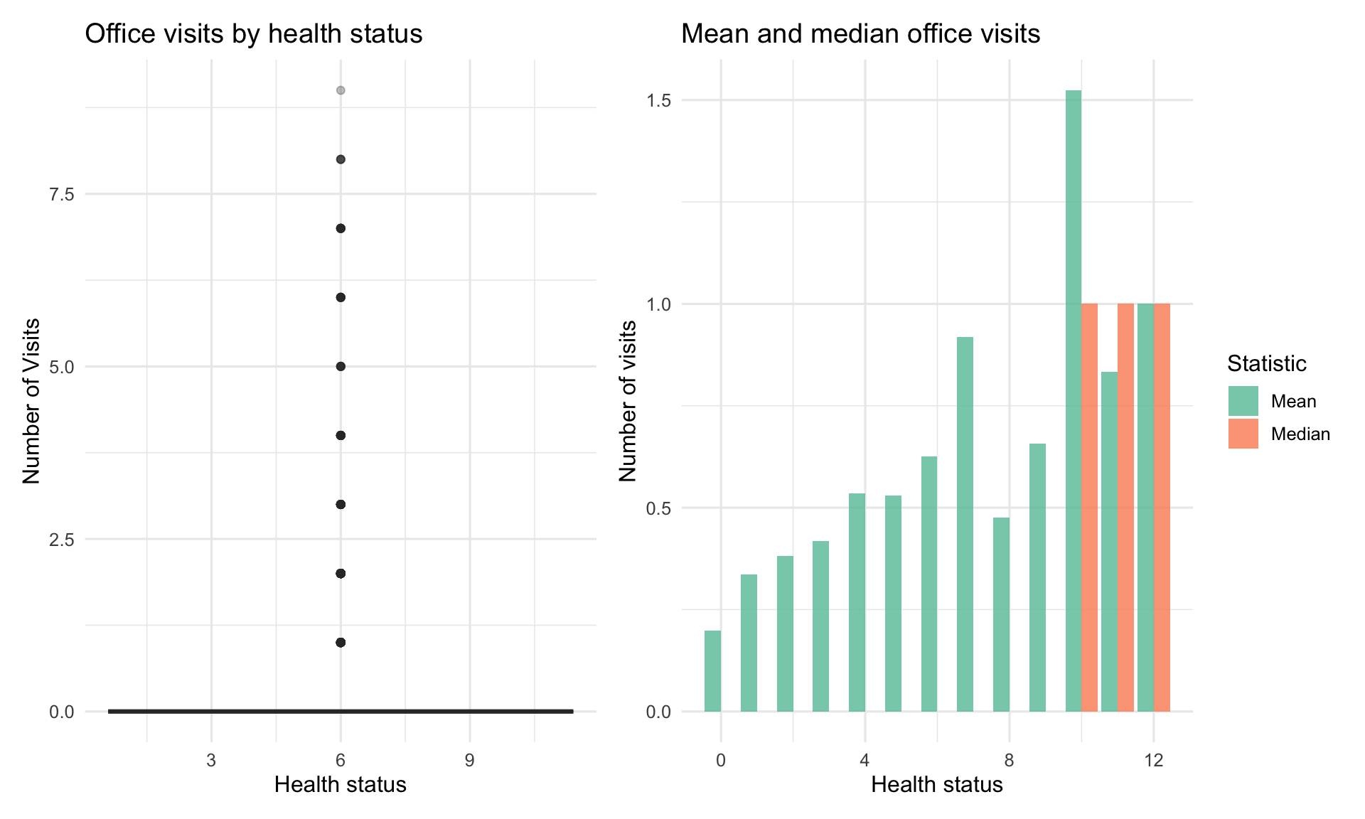
```{r visits-by-health}
#| label: fig-visits-health
#| fig-cap: "Office visits vary substantially by health status"
#| fig-width: 10
#| fig-height: 6
p1 <- ggplot(health_data, aes(x = health, y = visits, fill = health)) +
  geom_boxplot(alpha = 0.7, outlier.alpha = 0.3) +
  scale_fill_manual(values = c("poor" = "#e74c3c",
                                "average" = "#f39c12",
                                "excellent" = "#27ae60")) +
  labs(title = "Office visits by health status",
       x = "Health status",
       y = "Number of Visits") +
  theme_minimal(base_size = 12) +
  theme(legend.position = "none")

p2 <- health_data %>%
  group_by(health) %>%
  summarise(
    Mean = mean(visits),
    Median = median(visits),
    SD = sd(visits)
  ) %>%
  pivot_longer(cols = c(Mean, Median), names_to = "Statistic", values_to = "Value") %>%
  ggplot(aes(x = health, y = Value, fill = Statistic)) +
  geom_col(position = "dodge", alpha = 0.8) +
  scale_fill_brewer(palette = "Set2") +
  labs(title = "Mean and median office visits",
       x = "Health status",
       y = "Number of visits") +
  theme_minimal(base_size = 12)

p1 + p2
```
### Chronic conditions effect
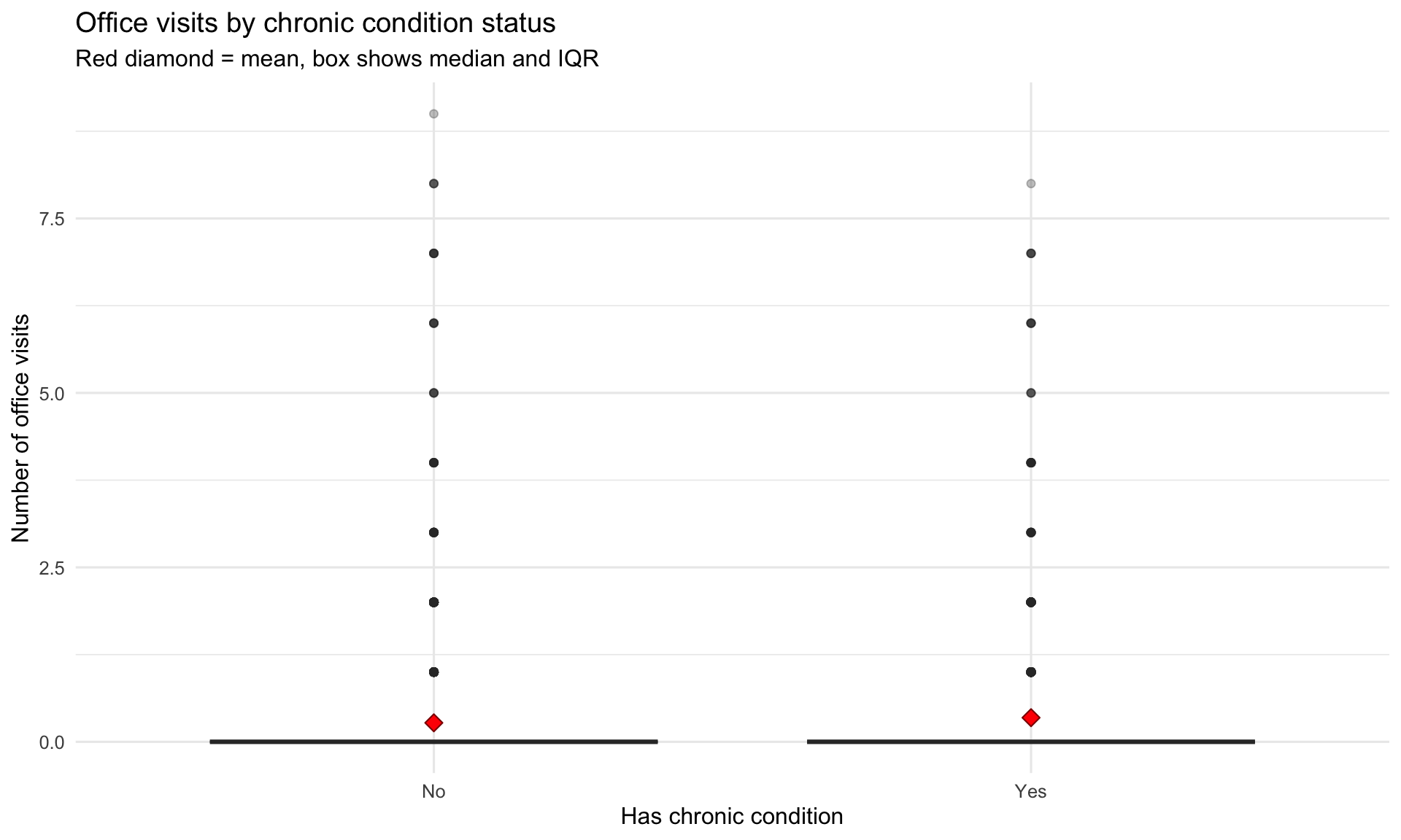
```{r visits-by-chronic}
#| label: fig-visits-chronic
#| fig-cap: "More chronic conditions strongly associated with more office visits"
#| fig-width: 10
#| fig-height: 6
health_data %>%
  ggplot(aes(x = chronic_condition, y = visits)) +
  geom_boxplot(fill = "coral", alpha = 0.7, outlier.alpha = 0.3) +
  stat_summary(fun = mean, geom = "point", shape = 23, size = 3,
               fill = "red", color = "darkred") +
  labs(title = "Office visits by chronic condition status",
       subtitle = "Red diamond = mean, box shows median and IQR",
       x = "Has chronic condition",
       y = "Number of office visits") +
  theme_minimal(base_size = 12)
```
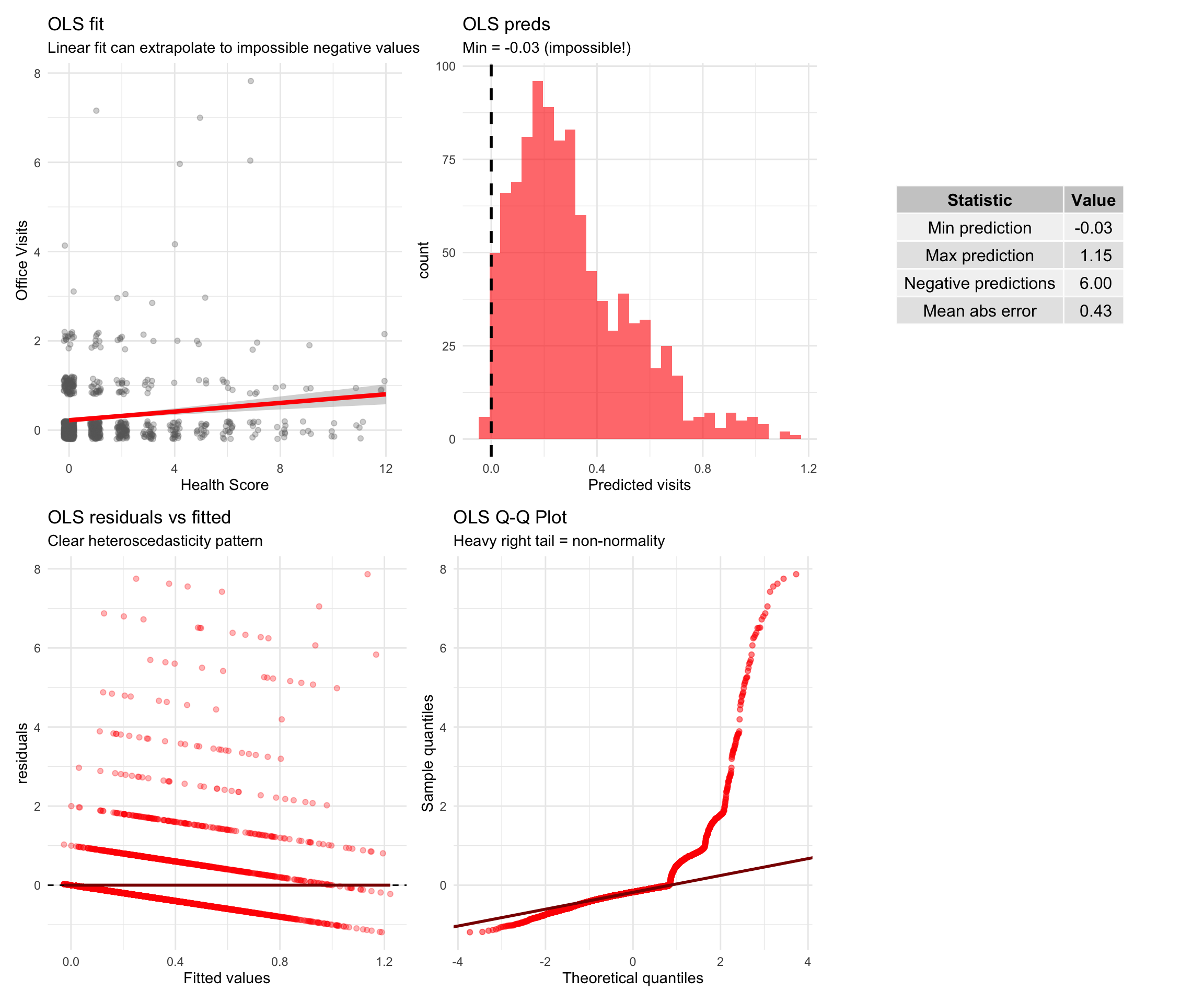
# Why not OLS?
Before diving into Poisson and Negative Binomial models, let's see **why ordinary least squares (OLS) regression fails** for count data.
```{r ols-vs-glm}
#| label: fig-ols-vs-glm
#| fig-cap: "OLS produces impossible predictions and violates assumptions for count data"
#| fig-width: 12
#| fig-height: 10
ols_model <- lm(visits ~ health + chronic_condition + gender + age_years +
                private_insurance + illness,
                data = health_data)

comparison_data <- health_data %>%
  slice_sample(n = 1000) %>%  # Sample for clearer visualization
  mutate(
    ols_pred = predict(ols_model, newdata = .)
  )

p1 <- ggplot(comparison_data, aes(x = health, y = visits)) +
  geom_jitter(alpha = 0.3, width = 0.2, height = 0.2, color = "gray40") +
  geom_smooth(method = "lm", se = TRUE, color = "red", linewidth = 1.5) +
  labs(title = "OLS fit",
       subtitle = "Linear fit can extrapolate to impossible negative values",
       x = "Health Score", y = "Office Visits") +
  theme_minimal(base_size = 11)

p2 <- ggplot(comparison_data, aes(x = ols_pred)) +
  geom_histogram(bins = 30, fill = "red", alpha = 0.6) +
  geom_vline(xintercept = 0, linetype = "dashed", linewidth = 1) +
  labs(title = "OLS preds",
       subtitle = paste0("Min = ", round(min(comparison_data$ols_pred), 2),
                        " (impossible!)"),
       x = "Predicted visits", y = "count") +
  theme_minimal(base_size = 11)

ols_diag <- data.frame(
  fitted = fitted(ols_model),
  residuals = residuals(ols_model)
)

p4 <- ggplot(ols_diag, aes(x = fitted, y = residuals)) +
  geom_point(alpha = 0.3, color = "red") +
  geom_hline(yintercept = 0, linetype = "dashed") +
  geom_smooth(se = FALSE, color = "darkred") +
  labs(title = "OLS residuals vs fitted",
       subtitle = "Clear heteroscedasticity pattern",
       x = "Fitted values", y = "residuals") +
  theme_minimal(base_size = 11)

p5 <- ggplot(ols_diag, aes(sample = residuals)) +
  stat_qq(color = "red", alpha = 0.5) +
  stat_qq_line(color = "darkred", linewidth = 1) +
  labs(title = "OLS Q-Q Plot",
       subtitle = "Heavy right tail = non-normality",
       x = "Theoretical quantiles", y = "Sample quantiles") +
  theme_minimal(base_size = 11)

ols_summary <- data.frame(
  Statistic = c("Min prediction", "Max prediction", "Negative predictions", "Mean abs error"),
  Value = c(min(comparison_data$ols_pred),
            max(comparison_data$ols_pred),
            sum(comparison_data$ols_pred < 0),
            mean(abs(comparison_data$visits - comparison_data$ols_pred)))
)

p3 <- gridExtra::tableGrob(ols_summary %>%
                            mutate(Value = round(Value, 2)),
                            rows = NULL)

(p1 | p2 | p3) / (p4 | p5 | plot_spacer())
```
::: {.callout-warning}
### Why OLS is not the most optimal model
1. OLS can predict negative counts (e.g., -0.5 doctor visits)
2. Variance increases with the mean, violating constant variance assumption
- People with many visits have more variable outcomes than those with few visits
3.Count data are right-skewed, violating normality of residuals
- Most people have 0-2 visits; a few have 10+
4. Counts follow discrete distributions (Poisson/Negative Binomial), not continuous normal
:::
::: {.callout-note}
### What about the coefficients?
You might wonder: "If I just use OLS for interpretation and ignore the predictions, is that okay?"
**No!** The coefficients and standard errors from OLS are also **biased and inconsistent** for count data:
- **Biased standard errors** → Wrong confidence intervals and p-values
- **Inefficient estimates** → Larger standard errors than necessary
- **Wrong interpretation** → OLS coefficients are additive, but count effects are multiplicative
We'll see the correct approach (Poisson/NB) produces **different coefficients** with the proper multiplicative interpretation.
:::
---
Now let's fit the **proper models** for count data.
# Poisson Regression
A count variable $Y$ follows a Poisson distribution with parameter $\lambda > 0$:
$$
P(Y = y) = \frac{e^{-\lambda} \lambda^y}{y!}, \quad y = 0, 1, 2, \ldots
$$
**Key property**: For Poisson, $E[Y] = \text{Var}(Y) = \lambda$.
### Poisson GLM
**Components**:
1. **Random component**: $Y_i \sim \text{Poisson}(\lambda_i)$
2. **Systematic component**: Linear predictor
$$
\eta_i = \beta_0 + \beta_1 x_{i1} + \cdots + \beta_p x_{ip}
$$
3. **Link function**: Log link (canonical for Poisson)
$$
\log(\lambda_i) = \eta_i
$$
**Mean structure**:
$$
\lambda_i = E[Y_i] = \exp(\eta_i) = \exp(\beta_0 + \beta_1 x_{i1} + \cdots + \beta_p x_{ip})
$$
### Interpretation of coefficients
For predictor $x_j$:
- $\beta_j$: Change in log-count per unit increase in $x_j$
- $\exp(\beta_j)$: **Multiplicative effect** on the count
- If $\exp(\beta_j) = 1.5$: A one-unit increase in $x_j$ multiplies the expected count by 1.5 (50% increase)
- If $\exp(\beta_j) = 0.8$: A one-unit increase in $x_j$ multiplies the expected count by 0.8 (20% decrease)
## Fitting Poisson model
```{r poisson-model}
#| label: poisson-model
# Fit Poisson GLM
poisson_model <- glm(visits ~ health + chronic_condition + gender + age_years + private_insurance + illness,
                     data = health_data,
                     family = poisson(link = "log"))

# Model summary
summary(poisson_model)
```
## Coefficient Interpretation
```{r poisson-coefs}
#| label: tbl-poisson-coefs
#| tbl-cap: "Poisson model coefficients with interpretation"
# Extract coefficients with confidence intervals
poisson_coefs <- tidy(poisson_model, conf.int = TRUE) %>%
  mutate(
    exp_estimate = exp(estimate),
    exp_conf_low = exp(conf.low),
    exp_conf_high = exp(conf.high),
    `Percent Change` = (exp_estimate - 1) * 100
  ) %>%
  dplyr::select(term, estimate, exp_estimate, `Percent Change`,
         exp_conf_low, exp_conf_high, p.value)

poisson_coefs %>%
  mutate(across(where(is.numeric), ~round(., 4))) %>%
  kable(col.names = c("Predictor", "β (log scale)", "exp(β)",
                      "% Change", "95% CI Lower", "95% CI Upper", "p-value"))
```
## Model diagnostics
### Testing for overdispersion
The Poisson assumption is $\text{Var}(Y) = E[Y]$. If variance exceeds the mean (**overdispersion**), Poisson underestimates standard errors.
```{r dispersion-test}
#| label: dispersion-test
disp_test <- dispersiontest(poisson_model)
print(disp_test)
pearson_resid <- residuals(poisson_model, type = "pearson")
dispersion_param <- sum(pearson_resid^2) / poisson_model$df.residual

cat("\n=== Overdispersion Check ===\n")
cat("Residual deviance:", poisson_model$deviance, "\n")
cat("Degrees of freedom:", poisson_model$df.residual, "\n")
cat("Deviance / df:", poisson_model$deviance / poisson_model$df.residual, "\n")
cat("Dispersion parameter (Pearson):", dispersion_param, "\n\n")
```
```{r}
if (dispersion_param > 1.5) {
  cat("Variance is", round(dispersion_param, 2), "times larger than mean.\n")
  cat("Poisson model may be inappropriate. Consider Negative Binomial.\n")
}
```
- Dispersion parameter = `{r} round(dispersion_param, 2)` (should be ≈ 1 for Poisson)
- This indicates **overdispersion** --> Use NB
### Residual plots
```{r poisson-diagnostics}
#| label: fig-poisson-diagnostics
#| fig-cap: "Diagnostic plots for Poisson model"
#| fig-width: 12
#| fig-height: 10
# Create diagnostic plots
par(mfrow = c(2, 2))

# 1. Residuals vs Fitted
plot(fitted(poisson_model), residuals(poisson_model, type = "pearson"),
     xlab = "Fitted balues", ylab = "Pearson residuals",
     main = "Residuals vs fitted", pch = 20, col = rgb(0, 0, 1, 0.3))
abline(h = 0, col = "red", lty = 2, lwd = 2)
abline(h = c(-2, 2), col = "orange", lty = 2)

# 2. Q-Q plot
qqnorm(residuals(poisson_model, type = "pearson"),
       main = "Normal Q-Q Plot",
       pch = 20, col = rgb(0, 0, 1, 0.3))
qqline(residuals(poisson_model, type = "pearson"), col = "red", lwd = 2)

# 3. Scale-Location
plot(fitted(poisson_model), sqrt(abs(residuals(poisson_model, type = "pearson"))),
     xlab = "Fitted values", ylab = "√|Pearson residuals|",
     main = "Scale-Location", pch = 20, col = rgb(0, 0, 1, 0.3))
lines(lowess(fitted(poisson_model), sqrt(abs(residuals(poisson_model, type = "pearson")))),
      col = "red", lwd = 2)

# 4. Residuals vs Leverage
plot(hatvalues(poisson_model), residuals(poisson_model, type = "pearson"),
     xlab = "Leverage", ylab = "Pearson Residuals",
     main = "Residuals vs Leverage", pch = 20, col = rgb(0, 0, 1, 0.3))
abline(h = 0, col = "red", lty = 2, lwd = 2)

par(mfrow = c(1, 1))
```
# Negative Binomial Regression
The Negative Binomial (NB) distribution is a generalization of Poisson that allows **overdispersion**.
**Two parameterizations**:
1. **Mean-dispersion form** (most common in GLMs):
$$
E[Y] = \mu, \quad \text{Var}(Y) = \mu + \frac{\mu^2}{\theta}
$$
where $\theta > 0$ is the **dispersion parameter**.
2. **Key property**: As $\theta \to \infty$, NB → Poisson
**When variance > mean**:
- If $\theta$ is small: High overdispersion
- If $\theta$ is large: Low overdispersion (closer to Poisson)
### NB GLM structure
Same as Poisson, but with different variance structure:
1. **Random component**: $Y_i \sim \text{NB}(\mu_i, \theta)$
2. **Systematic component**: $\eta_i = \beta_0 + \beta_1 x_{i1} + \cdots + \beta_p x_{ip}$
3. **Link function**: $\log(\mu_i) = \eta_i$
**Variance**: $\text{Var}(Y_i) = \mu_i + \frac{\mu_i^2}{\theta}$
The extra term $\frac{\mu_i^2}{\theta}$ allows variance to exceed the mean.
## Fitting the NB model
```{r nb-model}
#| label: nb-model
nb_model <- glm.nb(visits ~ health + chronic_condition + gender + age_years + private_insurance + illness,
                   data = health_data)

summary(nb_model)
```
```{r}
theta_hat <- nb_model$theta
cat("\n=== Dispersion Parameter ===\n")
cat("Theta (θ):", theta_hat, "\n")
cat("Standard Error:", nb_model$SE.theta, "\n")
```
## Coefficient interpretation
```{r nb-coefs}
#| label: tbl-nb-coefs
#| tbl-cap: "NB coefficients"
nb_coefs <- tidy(nb_model, conf.int = TRUE) %>%
  mutate(
    exp_estimate = exp(estimate),
    exp_conf_low = exp(conf.low),
    exp_conf_high = exp(conf.high),
    `Percent Change` = (exp_estimate - 1) * 100
  ) %>%
  dplyr::select(term, estimate, exp_estimate, `Percent Change`,
         exp_conf_low, exp_conf_high, p.value)

nb_coefs %>%
  mutate(across(where(is.numeric), ~round(., 4))) %>%
  kable(col.names = c("Predictor", "β (log scale)", "exp(β)",
                      "% Change", "95% CI Lower", "95% CI Upper", "p-value"))
```
**Interpretation is the same as Poisson**: $\exp(\beta_j)$ gives the multiplicative effect on the expected count.
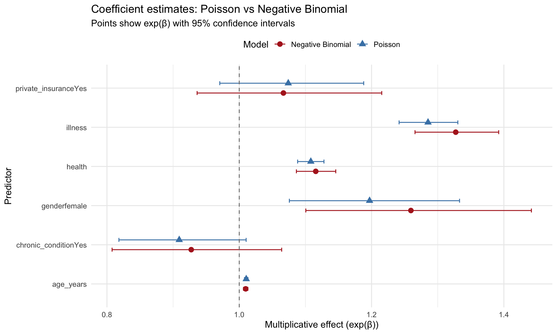
## Comparing Poisson vs NB
### Coefficient comparison
```{r model-comparison}
#| label: fig-coef-comparison
#| fig-cap: "Coefficient comparison: Poisson vs Negative Binomial"
#| fig-width: 10
#| fig-height: 6
# Combine coefficients from both models
coef_compare <- bind_rows(
  poisson_coefs %>% mutate(Model = "Poisson"),
  nb_coefs %>% mutate(Model = "Negative Binomial")
) %>%
  filter(term != "(Intercept)")

ggplot(coef_compare, aes(x = term, y = exp_estimate, color = Model, shape = Model)) +
  geom_point(size = 3, position = position_dodge(width = 0.5)) +
  geom_errorbar(aes(ymin = exp_conf_low, ymax = exp_conf_high),
                width = 0.2, position = position_dodge(width = 0.5)) +
  geom_hline(yintercept = 1, linetype = "dashed", color = "gray50") +
  coord_flip() +
  scale_color_manual(values = c("Poisson" = "steelblue",
                                 "Negative Binomial" = "firebrick")) +
  labs(title = "Coefficient estimates: Poisson vs Negative Binomial",
       subtitle = "Points show exp(β) with 95% confidence intervals",
       x = "Predictor",
       y = "Multiplicative effect (exp(β))") +
  theme_minimal(base_size = 12) +
  theme(legend.position = "top")
```
### Standard error comparison
```{r se-comparison}
#| label: tbl-se-comparison
#| tbl-cap: "Standard errors: Poisson tends to underestimate when overdispersed"
se_compare <- tibble(
  Predictor = names(coef(poisson_model))[-1],
  `Poisson SE` = summary(poisson_model)$coefficients[-1, "Std. Error"],
  `NB SE` = summary(nb_model)$coefficients[-1, "Std. Error"],
  `Ratio (NB/Poisson)` = `NB SE` / `Poisson SE`
)

se_compare %>%
  mutate(across(where(is.numeric), ~round(., 4))) %>%
  kable()
```
NB standard errors are **larger** than Poisson (ratio > 1) --> reflecting the true uncertainty when accounting for overdispersion.
### Model stats
We did not cover this in class, but it is not very difficult to understand. A good model should have lower akaike information criterion (AIC) and higher log-likelihood. We can compare the two models using these metrics, as well as a likelihood ratio test:
```{r model-fit}
#| label: tbl-model-fit
#| tbl-cap: "Model comparison: AIC and Log-Likelihood"
# Calculate AIC and log-likelihood
model_comparison <- tibble(
  Model = c("Poisson", "Negative Binomial"),
  `Log-Likelihood` = c(logLik(poisson_model), logLik(nb_model)),
  AIC = c(AIC(poisson_model), AIC(nb_model)),
  `Num Parameters` = c(length(coef(poisson_model)),
                       length(coef(nb_model)) + 1),  # +1 for theta
  `Deviance` = c(poisson_model$deviance, nb_model$deviance)
)

model_comparison %>%
  mutate(across(where(is.numeric), ~round(., 2))) %>%
  kable()
# Likelihood ratio test
lr_test <- 2 * (logLik(nb_model) - logLik(poisson_model))
lr_pval <- pchisq(lr_test, df = 1, lower.tail = FALSE)

cat("\n=== Likelihood Ratio Test ===\n")
cat("H0: Poisson is adequate (theta = infinity)\n")
cat("H1: Negative Binomial is needed (theta < infinity)\n\n")
cat("LR statistic:", lr_test, "\n")
cat("p-value:", format.pval(lr_pval), "\n\n")
```
```{r}
if (lr_pval < 0.001) {
  cat("CONCLUSION: Negative Binomial is significantly better (p < 0.001)\n")
} else if (lr_pval < 0.05) {
  cat("CONCLUSION: Negative Binomial is significantly better (p < 0.05)\n")
} else {
  cat("CONCLUSION: No significant difference between models\n")
}
```
**Lower AIC indicates better fit**: Negative Binomial has AIC = `{r} round(AIC(nb_model), 1)` vs Poisson AIC = `{r} round(AIC(poisson_model), 1)`.
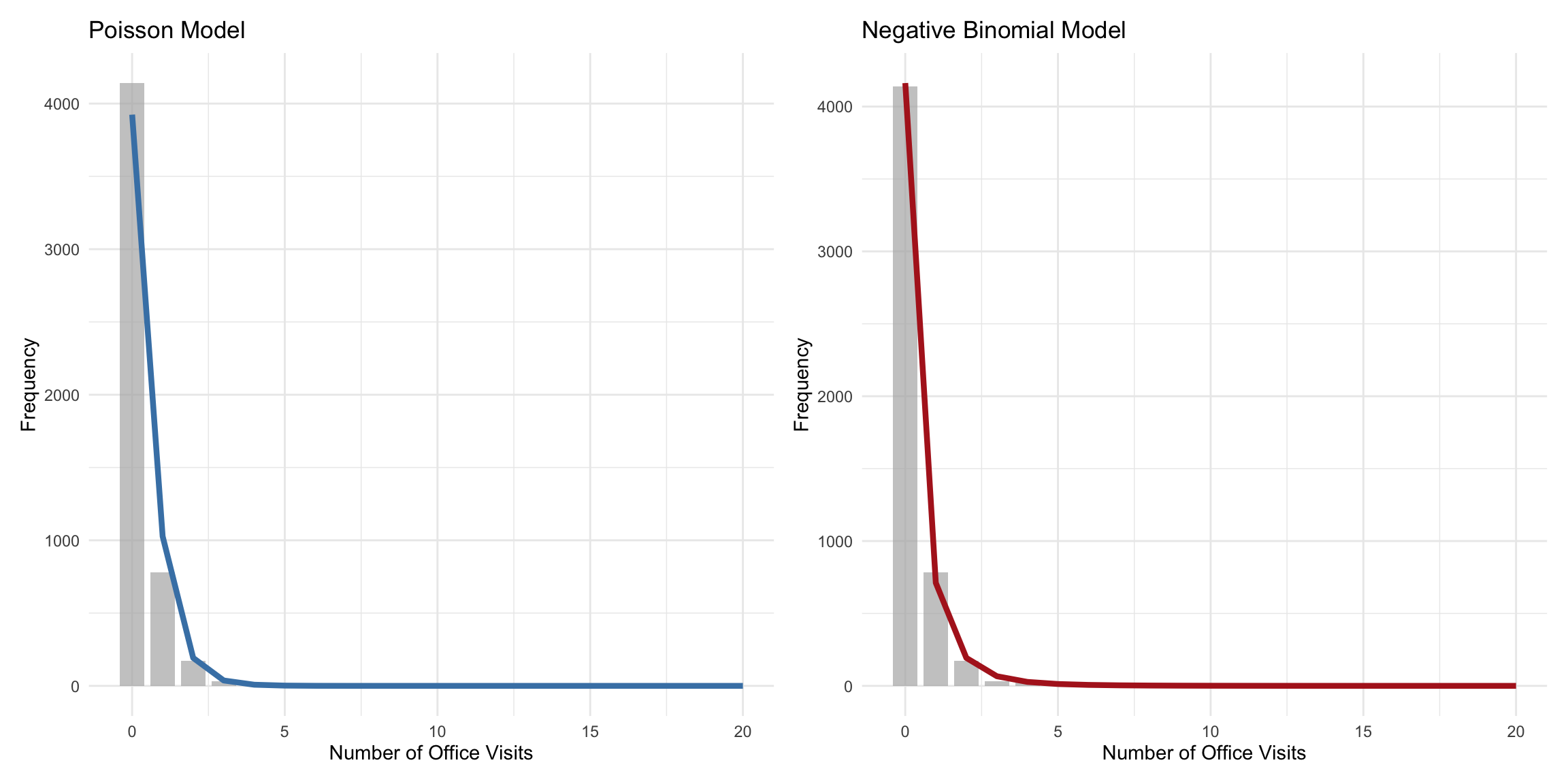
### Predicted vs Observed
```{r predicted-observed}
#| label: fig-predicted-observed
#| fig-cap: "Predicted vs observed counts: NB fits better at higher counts"
#| fig-width: 12
#| fig-height: 6
health_data <- health_data %>%
  mutate(
    pred_poisson = predict(poisson_model, type = "response"),
    pred_nb = predict(nb_model, type = "response")
  )

# Count frequencies
observed_freq <- health_data %>%
  count(visits) %>%
  rename(observed = n) %>%
  filter(visits <= 20)  # Limit for visualization

pred_freq <- health_data %>%
  summarise(
    across(c(pred_poisson, pred_nb),
           ~sum(dpois(0:20, lambda = .x)))
  ) %>%
  pivot_longer(everything(), names_to = "model", values_to = "predicted")

# Compare distributions
p1 <- ggplot() +
  geom_col(data = observed_freq, aes(x = visits, y = observed),
           fill = "gray70", alpha = 0.7, width = 0.8) +
  geom_line(data = tibble(visits = 0:20,
                          predicted = sapply(0:20, function(k)
                            sum(dpois(k, lambda = health_data$pred_poisson)))),
            aes(x = visits, y = predicted),
            color = "steelblue", linewidth = 1.5) +
  labs(title = "Poisson Model",
       x = "Number of Office Visits",
       y = "Frequency") +
  theme_minimal()

p2 <- ggplot() +
  geom_col(data = observed_freq, aes(x = visits, y = observed),
           fill = "gray70", alpha = 0.7, width = 0.8) +
  geom_line(data = tibble(visits = 0:20,
                          predicted = sapply(0:20, function(k)
                            sum(dnbinom(k, size = theta_hat,
                                       mu = health_data$pred_nb)))),
            aes(x = visits, y = predicted),
            color = "firebrick", linewidth = 1.5) +
  labs(title = "Negative Binomial Model",
       x = "Number of Office Visits",
       y = "Frequency") +
  theme_minimal()

p1 + p2
```
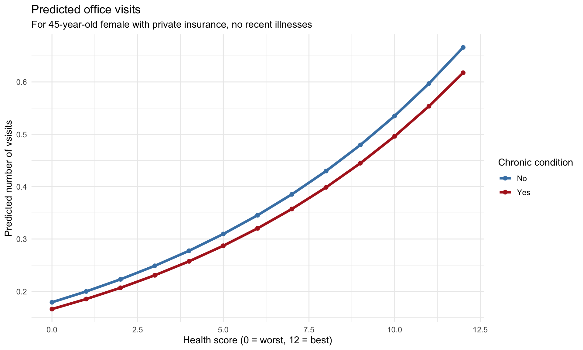
### Marginal Effects
```{r marginal-effects}
#| label: fig-marginal-effects
#| fig-cap: "Marginal effect of chronic conditions on office visits"
#| fig-width: 10
#| fig-height: 6
marginal_data <- expand.grid(
  health = 0:12,  # Health score range
  chronic_condition = factor(c("No", "Yes"), levels = c("No", "Yes")),
  gender = factor("female", levels = c("male", "female")),
  age_years = 45,
  private_insurance = factor("Yes", levels = c("No", "Yes")),
  illness = 0
)

# Predict
marginal_data <- marginal_data %>%
  mutate(
    predicted = predict(nb_model, newdata = ., type = "response")
  )

ggplot(marginal_data, aes(x = health, y = predicted, color = chronic_condition,
                          fill = chronic_condition)) +
  geom_line(linewidth = 1.5) +
  geom_point(size = 2) +
  scale_color_manual(values = c("No" = "steelblue", "Yes" = "firebrick"),
                     name = "Chronic condition") +
  scale_fill_manual(values = c("No" = "steelblue", "Yes" = "firebrick"),
                     name = "Chronic condition") +
  labs(title = "Predicted office visits",
       subtitle = "For 45-year-old female with private insurance, no recent illnesses",
       x = "Health score (0 = worst, 12 = best)",
       y = "Predicted number of vsisits") +
  theme_minimal(base_size = 12)
```
## References
1. Cameron, A. C., & Trivedi, P. K. (2013). *Regression Analysis of Count Data* (2nd ed.). Cambridge University Press.
2. Hilbe, J. M. (2011). *Negative Binomial Regression* (2nd ed.). Cambridge University Press.
## Session Info
```{r session-info}
#| echo: false
sessionInfo()
```