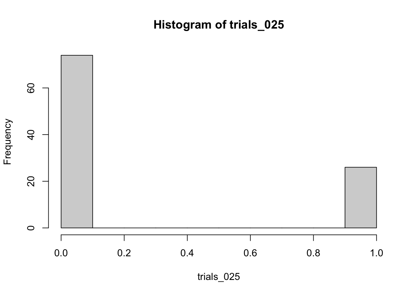
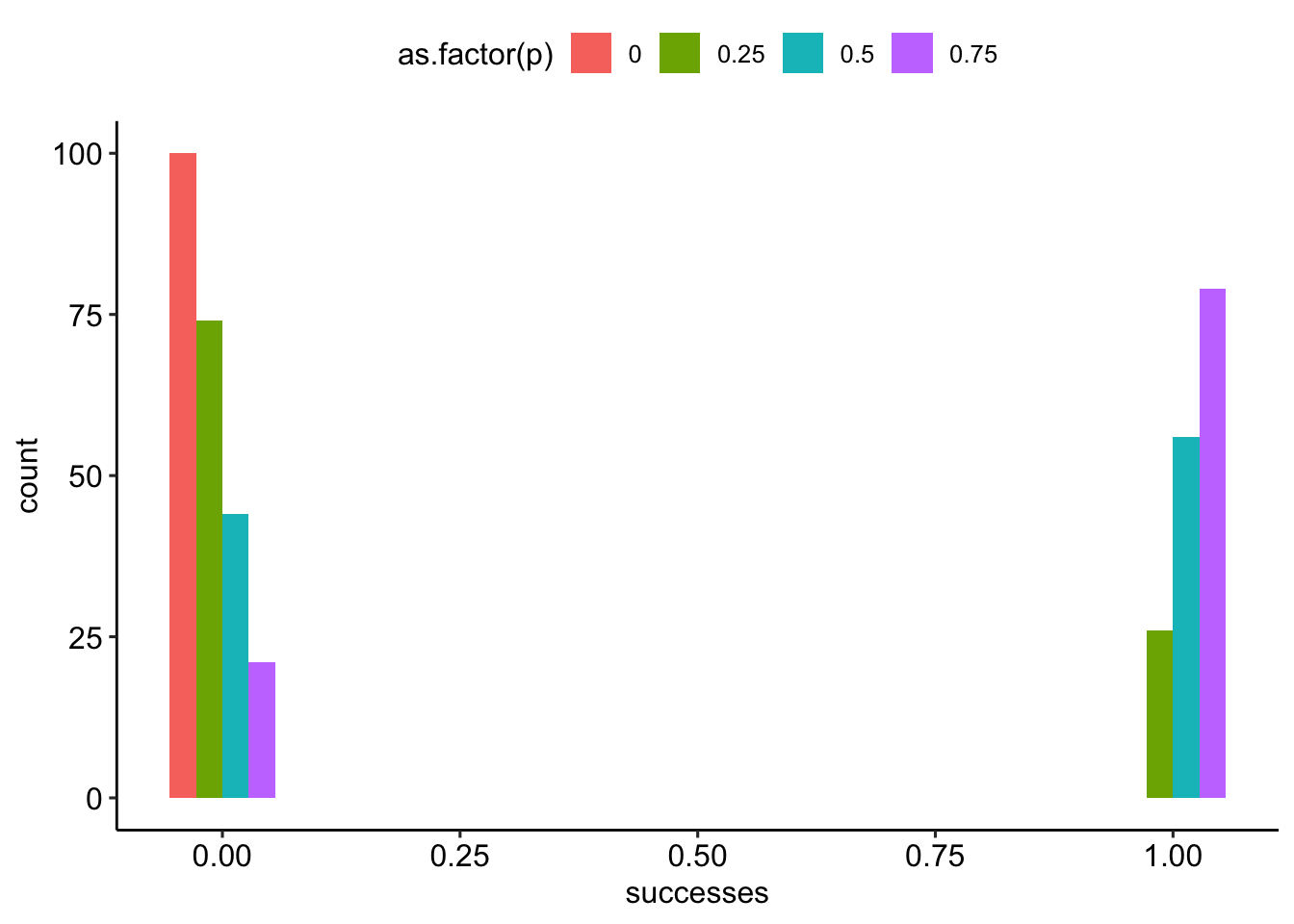
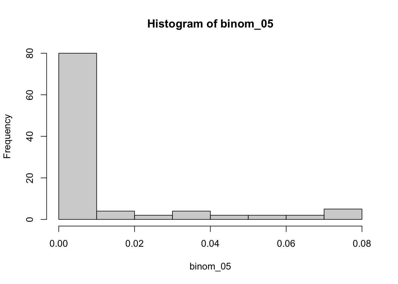
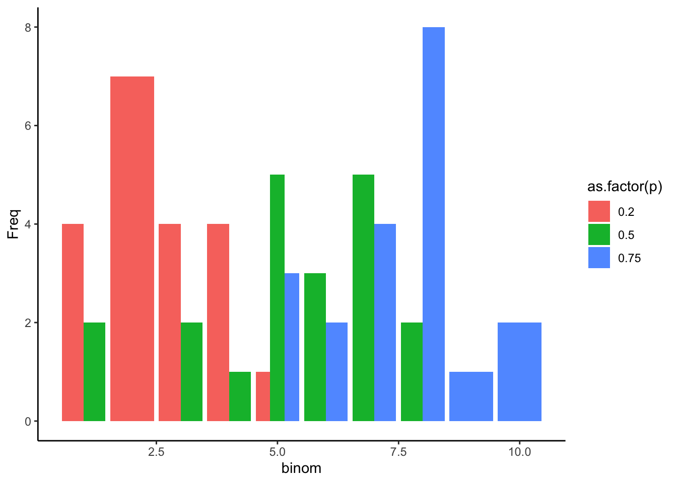
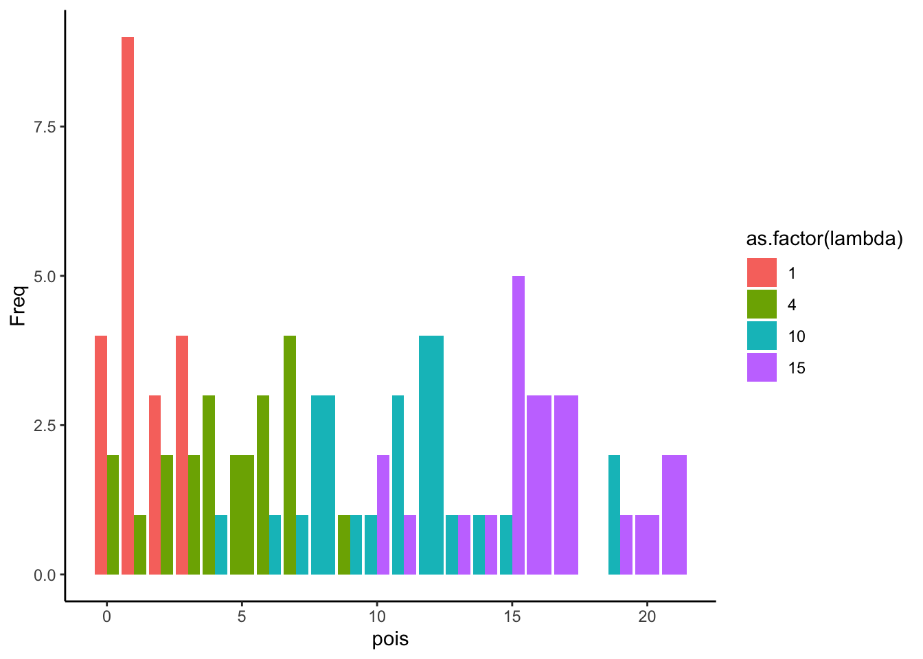
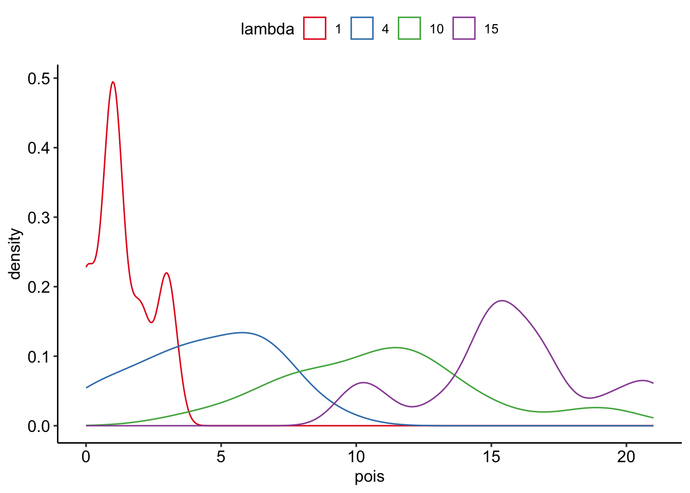
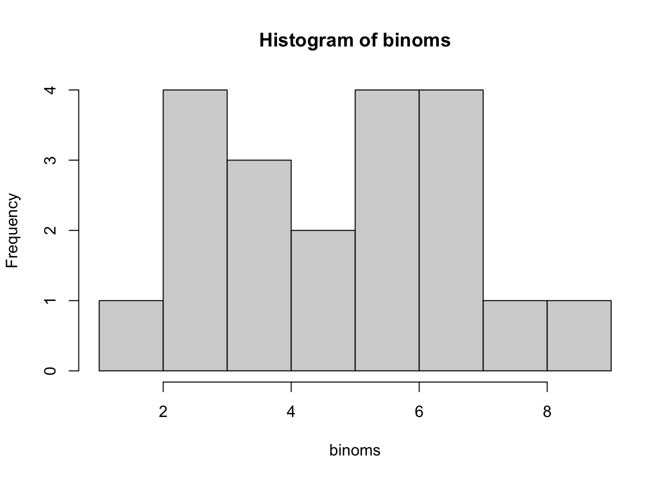
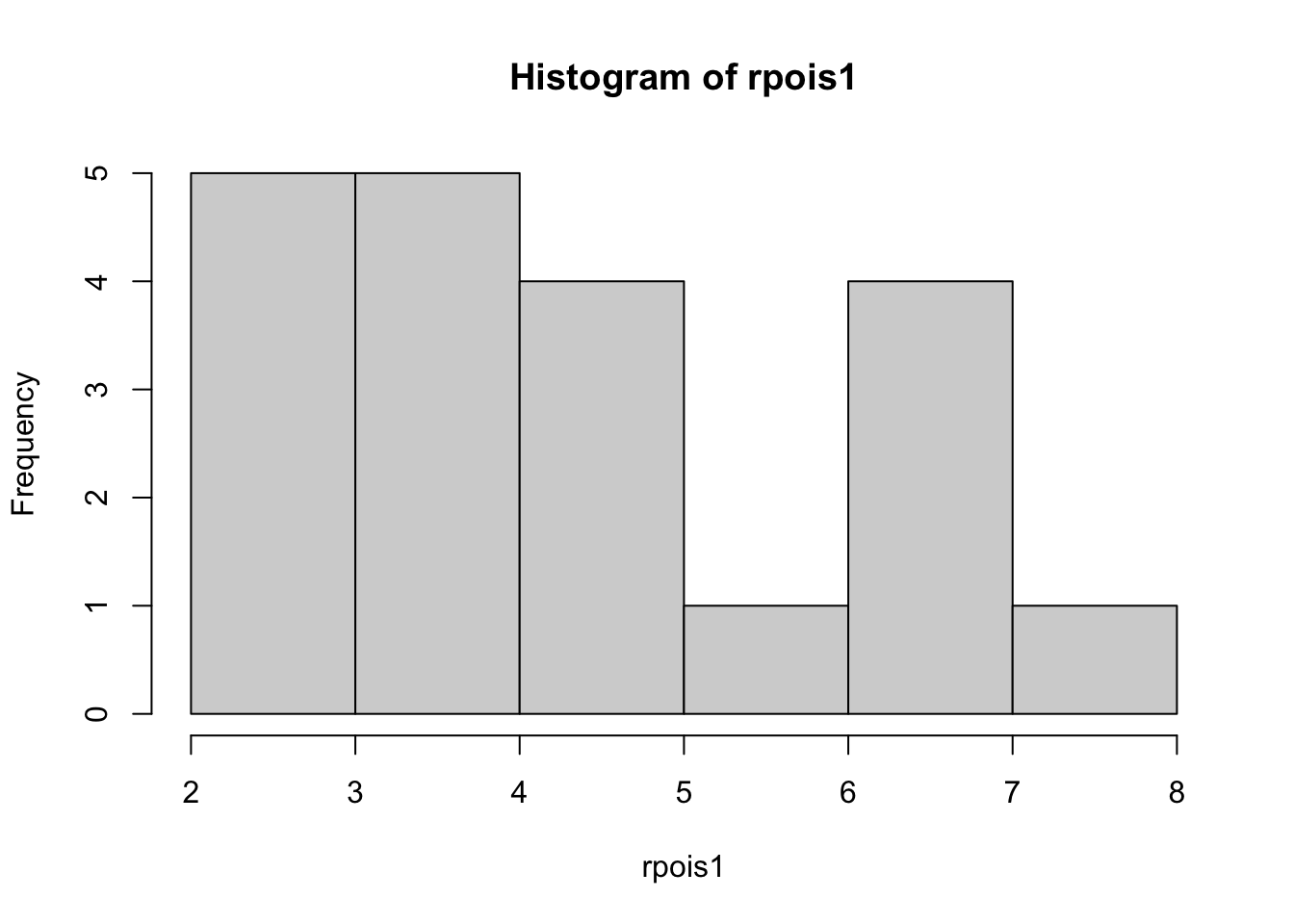
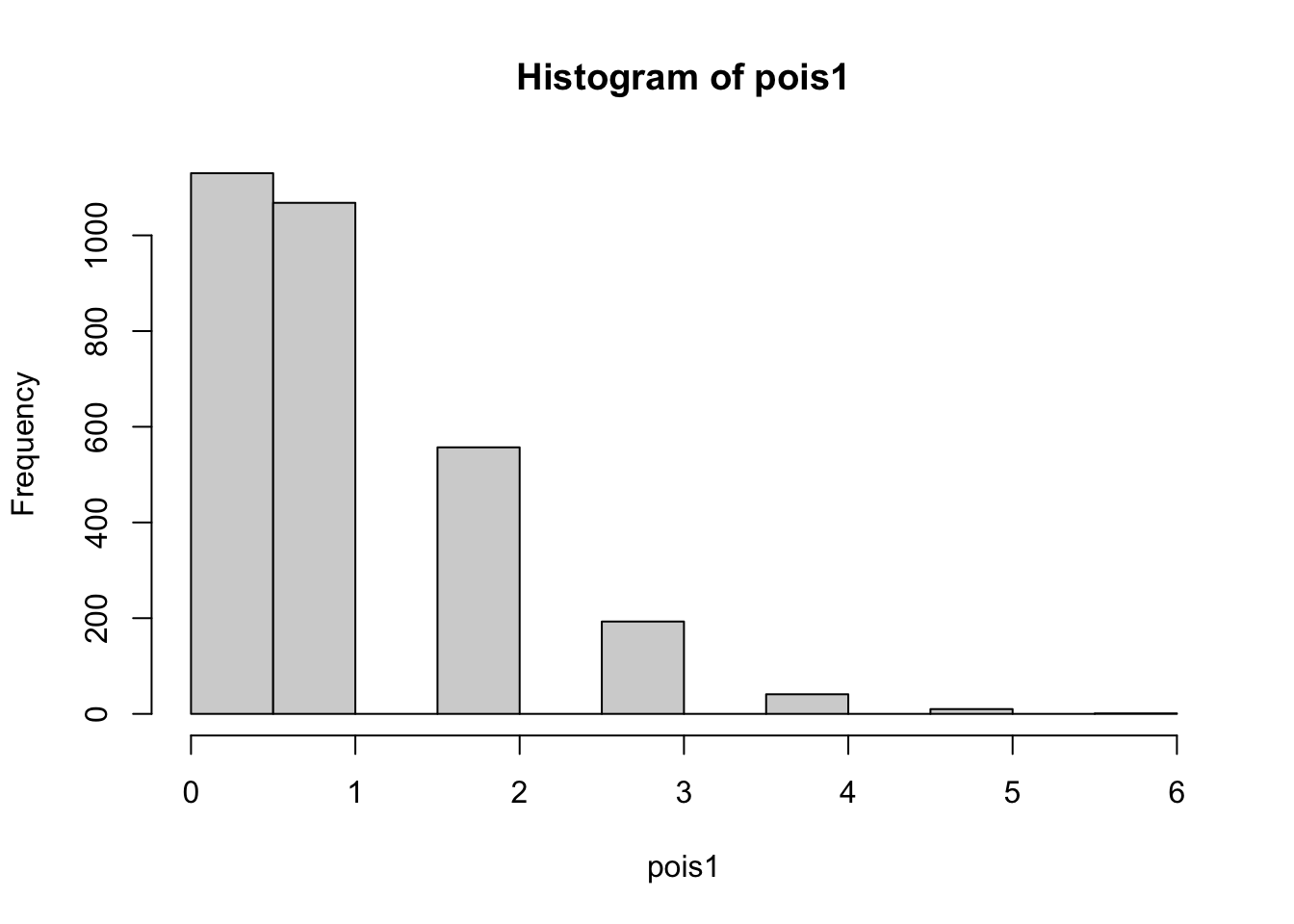
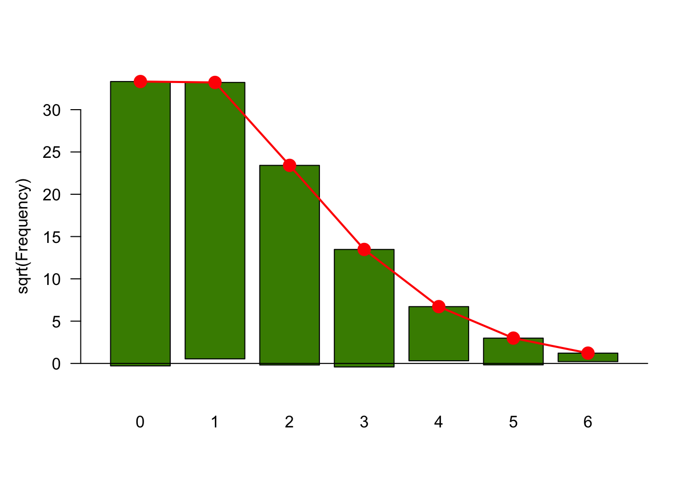
--- title: "Fitting Distributions" format: html: code-tools: true editor: visual --- ```{r} library (tidyverse)``` ## Bernoulli ```{r} ``` ```{r} # simulate 100 bernoulli trials set.seed (42 )<- rbinom (n = 100 , size = 1 , prob = 0.25 )``` ```{r} hist (trials_025)``` ## Varying p (or $\theta$) ```{r} set.seed (42 )<- c (0 , 0.25 , 0.5 , 0.75 )<- list ()for (p in ps) {<- rbinom (n = 100 , size = 1 , prob = p)<- data.frame (successes = trials)$ p <- pas.character (p)]] <- df<- dplyr:: bind_rows (data)ggplot (df_combined, aes (x = successes, fill = as.factor (p))) + geom_histogram (position = "dodge" , bins = 10 ) + :: theme_pubr ()``` ## Estimating $\hat{theta}$ \\ \\ \\ \\ \\ ## Calculating likelihood ```{r} 1 : 10 ]``` ```{r} dbinom (x = trials_025, prob = 0.25 , size = 1 )[1 : 10 ]``` ## Calculating log-likelihood ```{r} <- function (p, data) {<- sum (dbinom (x = data, prob = p, size = 1 , log = TRUE ))return (LL)``` ```{r} log_likelihood_bernoulli (p = 0.5 , data = trials_025)``` ```{r} log_likelihood_bernoulli (p = 0.25 , data = trials_025)``` ```{r} log_likelihood_bernoulli (p = 0.1 , data = trials_025)``` ## Where does the LL get maximum? ```{r} <- seq (0 , 1 , 0.05 )<- sapply (p, log_likelihood_bernoulli, data = trials_025)<- data.frame (p = p, ll = ll)ggplot (df, aes (p, ll)) + geom_point () + theme_classic ()``` ```{r} %>% arrange (desc (ll))``` # Binomial ```{r} <- 0.5 <- 100 <- dbinom (x = 0 : 100 , prob = p, size = N)sum (binom_05)``` ```{r} hist (binom_05)``` ```{r} <- 10 <- c (0.2 , 0.5 , 0.75 )set.seed (42 )<- list ()for (p in p_vec) {<- rbinom (n = 20 , prob = p, size = N)<- data.frame (binom = binoms)$ p <- ppaste0 (p)]] <- df<- bind_rows (binoms.list)<- binoms.df %>% group_by (binom, p) %>% summarise (Freq = n ())ggplot (binoms.df.freq, aes (binom, Freq, fill = as.factor (p))) + geom_bar (position = "dodge" , stat = "identity" ) + theme_classic ()``` ```{r} ``` # Poisson ```{r} <- c (1 , 4 , 10 , 15 )set.seed (42 )<- list ()for (lambda in lambdas) {<- rpois (n = 20 , lambda = lambda)<- table (pois) %>% as.data.frame ()<- data.frame (pois = pois)$ lambda <- lambdapaste0 (lambda)]] <- df<- bind_rows (pois.data)<- pois.df %>% group_by (pois, lambda) %>% summarise (Freq = n ())ggplot (pois.df.freq, aes (pois, Freq, fill = as.factor (lambda))) + geom_bar (position = "dodge" , stat = "identity" ) + theme_classic ()``` ```{r} ggplot (pois.df, aes (pois, color = as.factor (lambda))) + geom_density () + :: theme_pubr () + scale_color_brewer (palette = "Set1" , name = "lambda" )``` # Why is a poisson used for rare events? ```{r} <- 0.05 <- 100 <- rbinom (n = 20 , prob = p, size = N)hist (binoms)``` ```{r} <- rpois (n = 20 , lambda = N* p )hist (rpois1)``` ## Investigating fit using vcd [ vcd ](https://cran.r-project.org/web/packages/vcd/index.html) to visualize if the data follows a poisson distribution.```{r} library (vcd)<- rpois (n = 3000 , lambda = 1 )hist (pois1)``` ```{r} <- goodfit (x = pois1, type = "poisson" )rootogram (pois1fit, xlab = "" , rect_gp = gpar (fill = "chartreuse4" ))```