Lecture 9: PCA Step by Step - Visual Understanding
Author
DH302
library(tidyverse)
── Attaching core tidyverse packages ──────────────────────── tidyverse 2.0.0 ──
✔ dplyr     1.1.4     ✔ readr     2.1.5
✔ forcats   1.0.0     ✔ stringr   1.5.1
✔ ggplot2   3.5.2     ✔ tibble    3.3.0
✔ lubridate 1.9.4     ✔ tidyr     1.3.1
✔ purrr     1.1.0
── Conflicts ────────────────────────────────────────── tidyverse_conflicts() ──
✖ dplyr::filter() masks stats::filter()
✖ dplyr::lag()    masks stats::lag()
ℹ Use the conflicted package (<http://conflicted.r-lib.org/>) to force all conflicts to become errors
library(patchwork)set.seed(2) # Generate synthetic data with correlationx <-1:100ex <-rnorm(100, 0, 25) # gaussian blob for xey <-rnorm(100, 0, 25) # gaussian blob for yy <-25+2* x # y is linearly related to xx_obs <- x + ex # add noise to xy_obs <- y + ey # add noise to y# Create data frame for plottingdata_original <-data.frame(x = x_obs,y = y_obs,type ="Original Data")
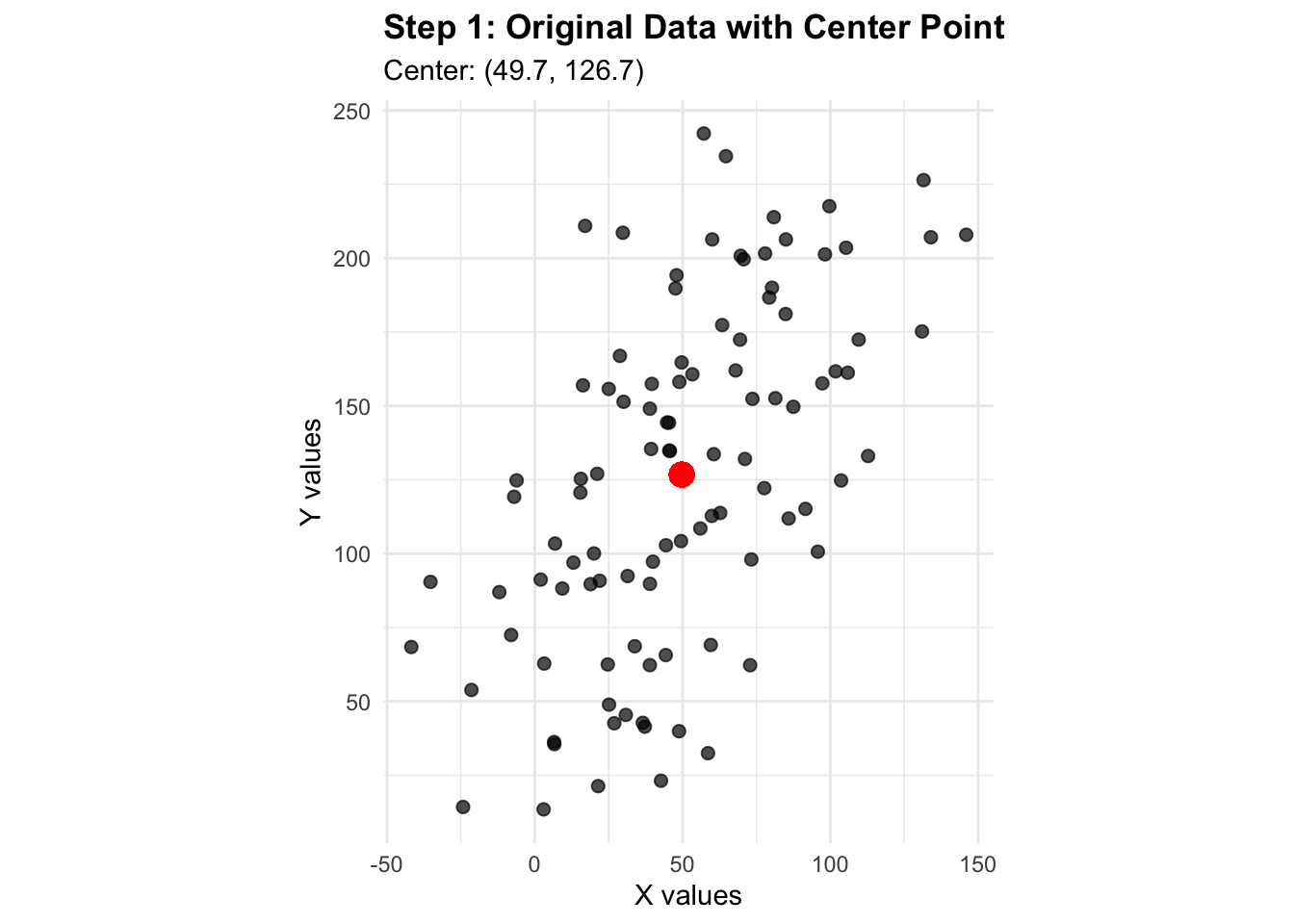
Step 1: Original Data with Center Point
Let’s first look at our raw data and identify the center (mean) point:
# Calculate center pointcenter_x <-mean(x_obs)center_y <-mean(y_obs)p1 <-ggplot(data_original, aes(x = x, y = y)) +geom_point(alpha =0.7, size =2, color ="black") +geom_point(aes(x = center_x, y = center_y), color ="red", size =4, shape =19) +labs(title ="Step 1: Original Data with Center Point",subtitle =paste0("Center: (", round(center_x, 1), ", ", round(center_y, 1), ")"),x ="X values", y ="Y values") +theme_minimal() +coord_fixed() +theme(plot.title =element_text(face ="bold"))p1
Warning in geom_point(aes(x = center_x, y = center_y), color = "red", size = 4, : All aesthetics have length 1, but the data has 100 rows.
ℹ Please consider using `annotate()` or provide this layer with data containing
  a single row.
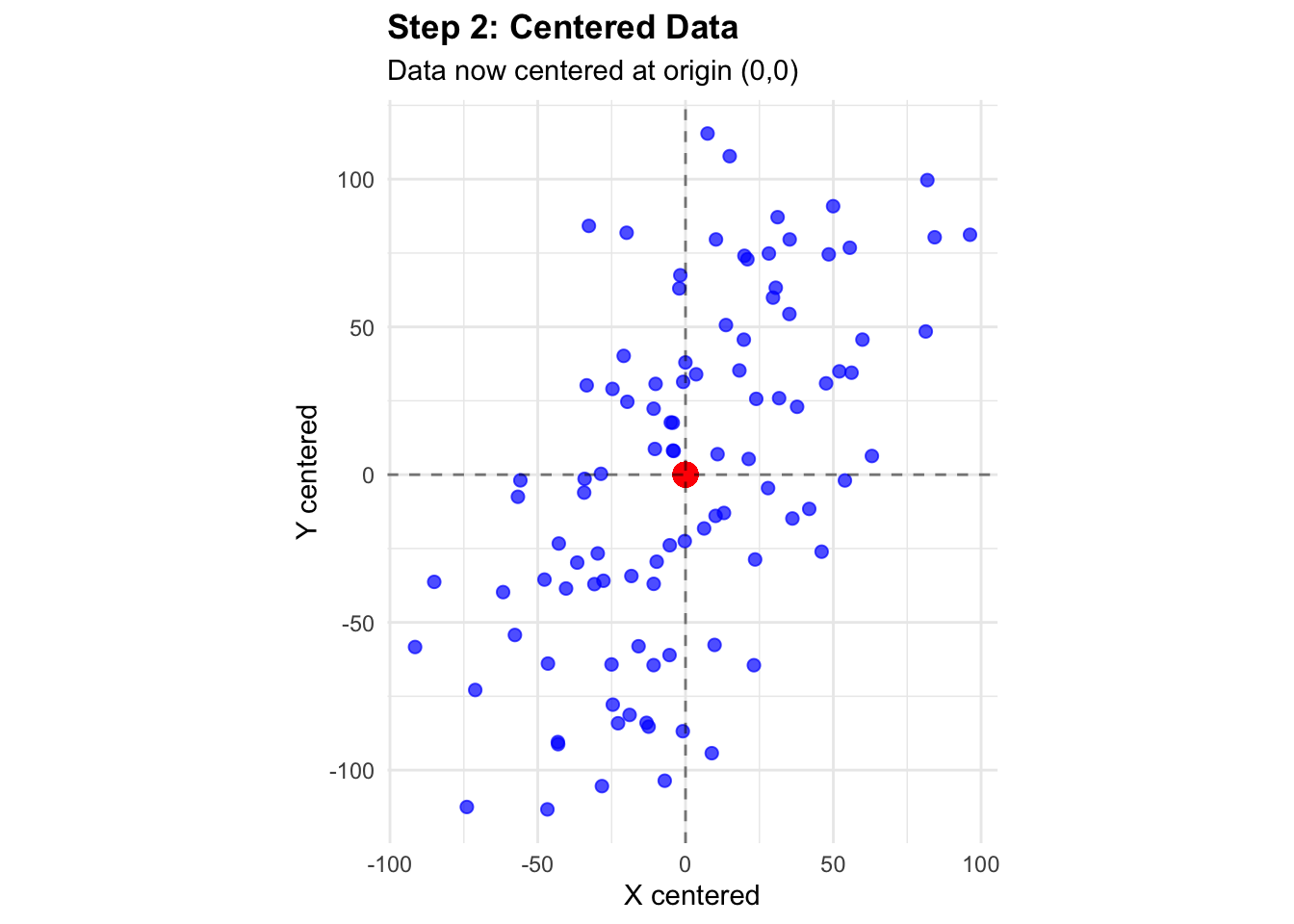
Step 2: Center the Data
PCA requires centered data (mean = 0). Let’s subtract the mean from each variable:
# Center the dataM <-cbind(x_obs - center_x, y_obs - center_y)colnames(M) <-c("x_centered", "y_centered")data_centered <-data.frame(x = M[, 1],y = M[, 2],type ="Centered Data")p2 <-ggplot(data_centered, aes(x = x, y = y)) +geom_point(alpha =0.7, size =2, color ="blue") +geom_point(aes(x =0, y =0), color ="red", size =4, shape =19) +geom_hline(yintercept =0, linetype ="dashed", alpha =0.5) +geom_vline(xintercept =0, linetype ="dashed", alpha =0.5) +labs(title ="Step 2: Centered Data",subtitle ="Data now centered at origin (0,0)",x ="X centered", y ="Y centered") +theme_minimal() +coord_fixed() +theme(plot.title =element_text(face ="bold"))p2
Warning in geom_point(aes(x = 0, y = 0), color = "red", size = 4, shape = 19): All aesthetics have length 1, but the data has 100 rows.
ℹ Please consider using `annotate()` or provide this layer with data containing
  a single row.
Step 3: Calculate Covariance Matrix and Eigenanalysis
Now we compute the covariance matrix and find its eigenvalues and eigenvectors:
# Compute eigenvalues and eigenvectorseigen_result <-eigen(MCov)eigenValues <- eigen_result$valueseigenVectors <- eigen_result$vectors# Alternatively we can calcucate svd of the original central matrixd <-svd(M)$d # singular valuesv <-svd(M)$v # right singular values# Calculate proportion of variance explainedvar_explained <- eigenValues /sum(eigenValues)print("Proportion of variance explained by each PC:")
[1] "Proportion of variance explained by each PC:"
# Show that eigeValues of MCov and singular vlaues of M are sameprint(sum(eigenValues-d))
[1] 3912.914
# Show that eigenVectors of MCov and right singular vlaues of M are sameprint(sum(eigenVectors-v))
[1] 1.110223e-16
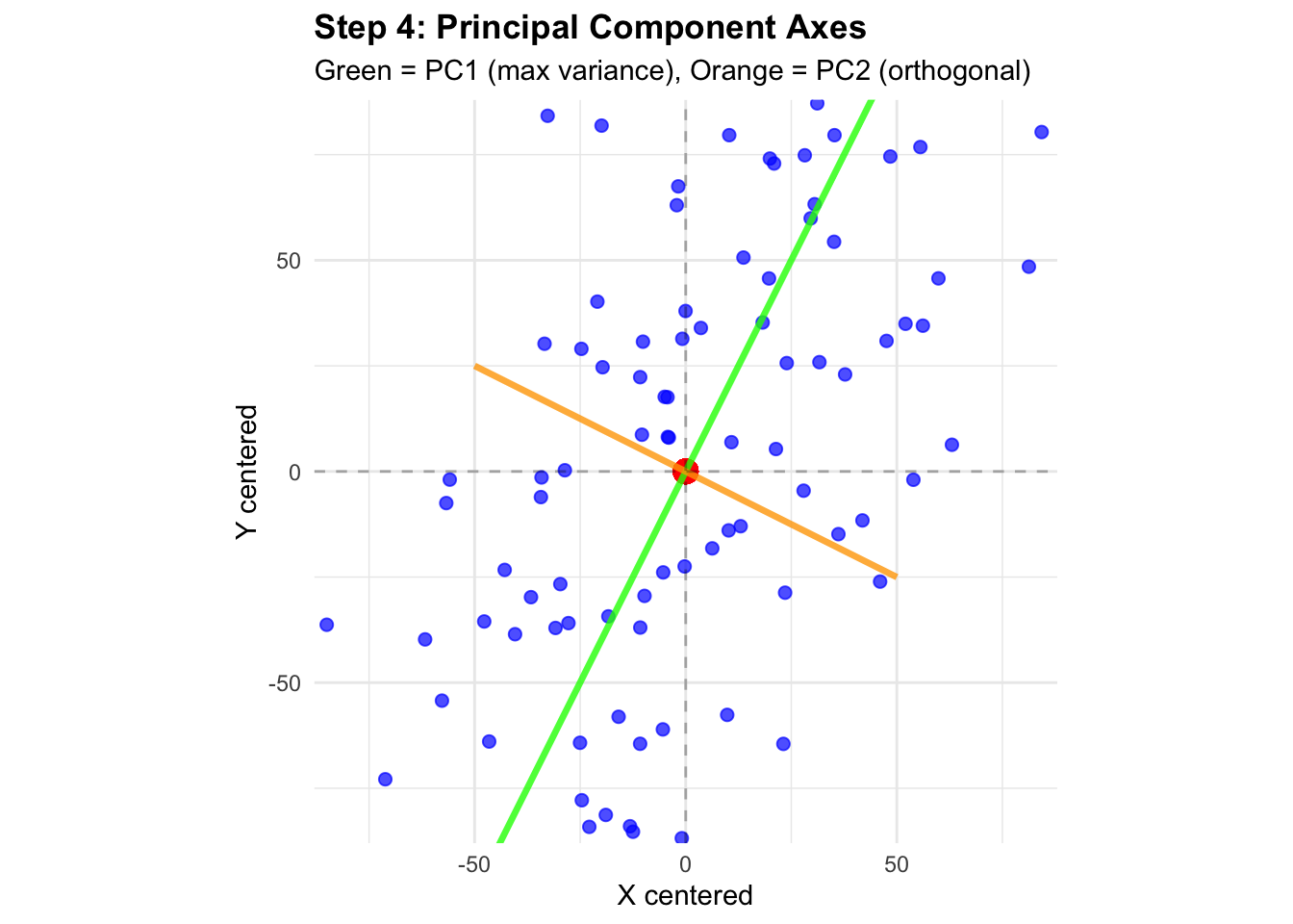
Step 4: Visualize Principal Component Directions
Let’s add the principal component axes to our centered data:
# Create lines for principal components# PC1 direction (first eigenvector)pc1_slope <- eigenVectors[2, 1] / eigenVectors[1, 1]# PC2 direction (second eigenvector) pc2_slope <- eigenVectors[2, 2] / eigenVectors[1, 2]# Create line segments for visualizationline_length <-50# Extend lines in both directions# PC1 line pointspc1_x <-c(-line_length, line_length)pc1_y <- pc1_slope * pc1_x# PC2 line points pc2_x <-c(-line_length, line_length)pc2_y <- pc2_slope * pc2_x# Plot with principal component axesp3 <-ggplot(data_centered, aes(x = x, y = y)) +geom_point(alpha =0.7, size =2, color ="blue") +geom_point(aes(x =0, y =0), color ="red", size =4, shape =19) +geom_line(data =data.frame(x = pc1_x, y = pc1_y), aes(x = x, y = y), color ="green", size =1.2, alpha =0.8) +geom_line(data =data.frame(x = pc2_x, y = pc2_y), aes(x = x, y = y), color ="orange", size =1.2, alpha =0.8) +geom_hline(yintercept =0, linetype ="dashed", alpha =0.3) +geom_vline(xintercept =0, linetype ="dashed", alpha =0.3) +labs(title ="Step 4: Principal Component Axes",subtitle ="Green = PC1 (max variance), Orange = PC2 (orthogonal)",x ="X centered", y ="Y centered") +theme_minimal() +coord_fixed(xlim =c(-80, 80), ylim =c(-80, 80)) +theme(plot.title =element_text(face ="bold"))
Warning: Using `size` aesthetic for lines was deprecated in ggplot2 3.4.0.
ℹ Please use `linewidth` instead.
p3
Warning in geom_point(aes(x = 0, y = 0), color = "red", size = 4, shape = 19): All aesthetics have length 1, but the data has 100 rows.
ℹ Please consider using `annotate()` or provide this layer with data containing
  a single row.
print(paste("PC1 explains", round(var_explained[1] *100, 1), "% of variance"))
[1] "PC1 explains 82.9 % of variance"
print(paste("PC2 explains", round(var_explained[2] *100, 1), "% of variance"))
[1] "PC2 explains 17.1 % of variance"
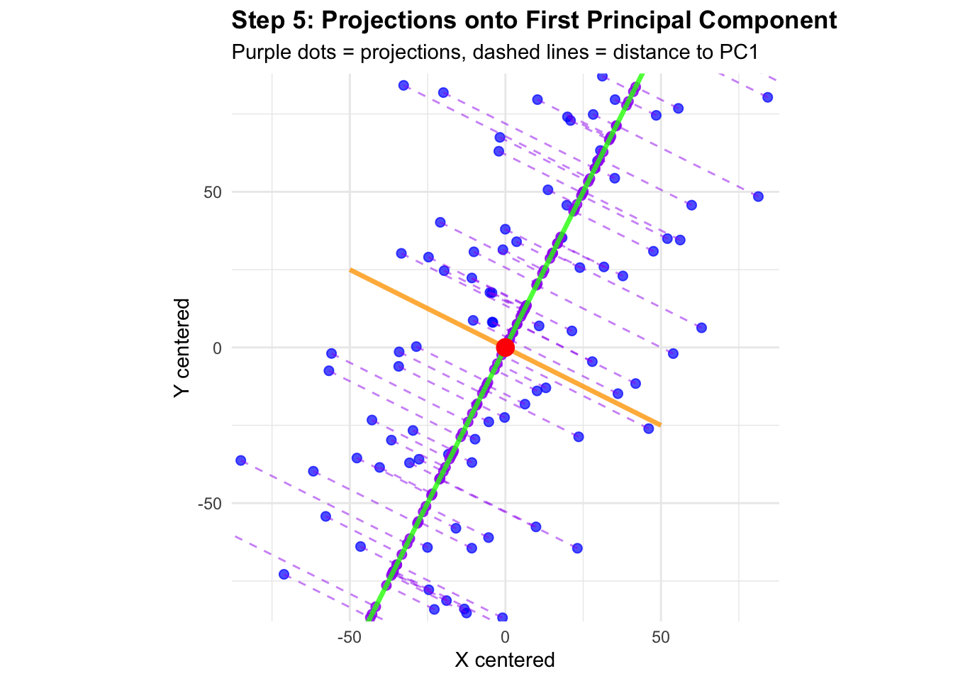
Step 5: Project Data onto First Principal Component
# Project data onto first principal component# Projection formula: (M · v1) * v1pc1_vector <- eigenVectors[, 1]projections_pc1 <- (M %*% pc1_vector) %*%t(pc1_vector)# Create data frame with original points and projectionsdata_with_projections <-data.frame(x_orig = M[, 1],y_orig = M[, 2],x_proj = projections_pc1[, 1],y_proj = projections_pc1[, 2])# Plot with projectionsp4 <-ggplot() +# Original pointsgeom_point(data = data_with_projections, aes(x = x_orig, y = y_orig), alpha =0.7, size =2, color ="blue") +# Projected pointsgeom_point(data = data_with_projections, aes(x = x_proj, y = y_proj), color ="purple", size =2, alpha =0.8) +# Connection linesgeom_segment(data = data_with_projections,aes(x = x_orig, y = y_orig, xend = x_proj, yend = y_proj),color ="purple", alpha =0.5, linetype ="dashed") +# Principal component axesgeom_line(data =data.frame(x = pc1_x, y = pc1_y), aes(x = x, y = y), color ="green", size =1.2, alpha =0.8) +geom_line(data =data.frame(x = pc2_x, y = pc2_y), aes(x = x, y = y), color ="orange", size =1.2, alpha =0.8) +geom_point(aes(x =0, y =0), color ="red", size =4, shape =19) +labs(title ="Step 5: Projections onto First Principal Component",subtitle ="Purple dots = projections, dashed lines = distance to PC1",x ="X centered", y ="Y centered") +theme_minimal() +coord_fixed(xlim =c(-80, 80), ylim =c(-80, 80)) +theme(plot.title =element_text(face ="bold"))print(p4)
Step 6: Transform to Principal Component Coordinates
Finally, let’s transform our data to the principal component coordinate system:
# Transform data to PC coordinates# PC scores = M * eigenvectorspc_scores <- M %*% eigenVectorscolnames(pc_scores) <-c("PC1", "PC2")# Create data frame for PC spacedata_pc_space <-data.frame(PC1 = pc_scores[, 1],PC2 = pc_scores[, 2])# Plot in PC coordinate systemp5 <-ggplot(data_pc_space, aes(x = PC1, y = PC2)) +geom_point(alpha =0.7, size =2, color ="darkgreen") +geom_point(aes(x =0, y =0), color ="red", size =4, shape =19) +geom_hline(yintercept =0, linetype ="dashed", alpha =0.5) +geom_vline(xintercept =0, linetype ="dashed", alpha =0.5) +labs(title ="Step 6: Data in Principal Component Space",subtitle =paste0("PC1 (", round(var_explained[1]*100, 1), "% var) vs PC2 (", round(var_explained[2]*100, 1), "% var)"),x =paste0("PC1 (", round(var_explained[1]*100, 1), "% of variance)"), y =paste0("PC2 (", round(var_explained[2]*100, 1), "% of variance)")) +theme_minimal() +coord_fixed() +theme(plot.title =element_text(face ="bold"))print(p5)
Warning in geom_point(aes(x = 0, y = 0), color = "red", size = 4, shape = 19): All aesthetics have length 1, but the data has 100 rows.
ℹ Please consider using `annotate()` or provide this layer with data containing
  a single row.
print("Standard deviations of principal components:")
[1] "Standard deviations of principal components:"
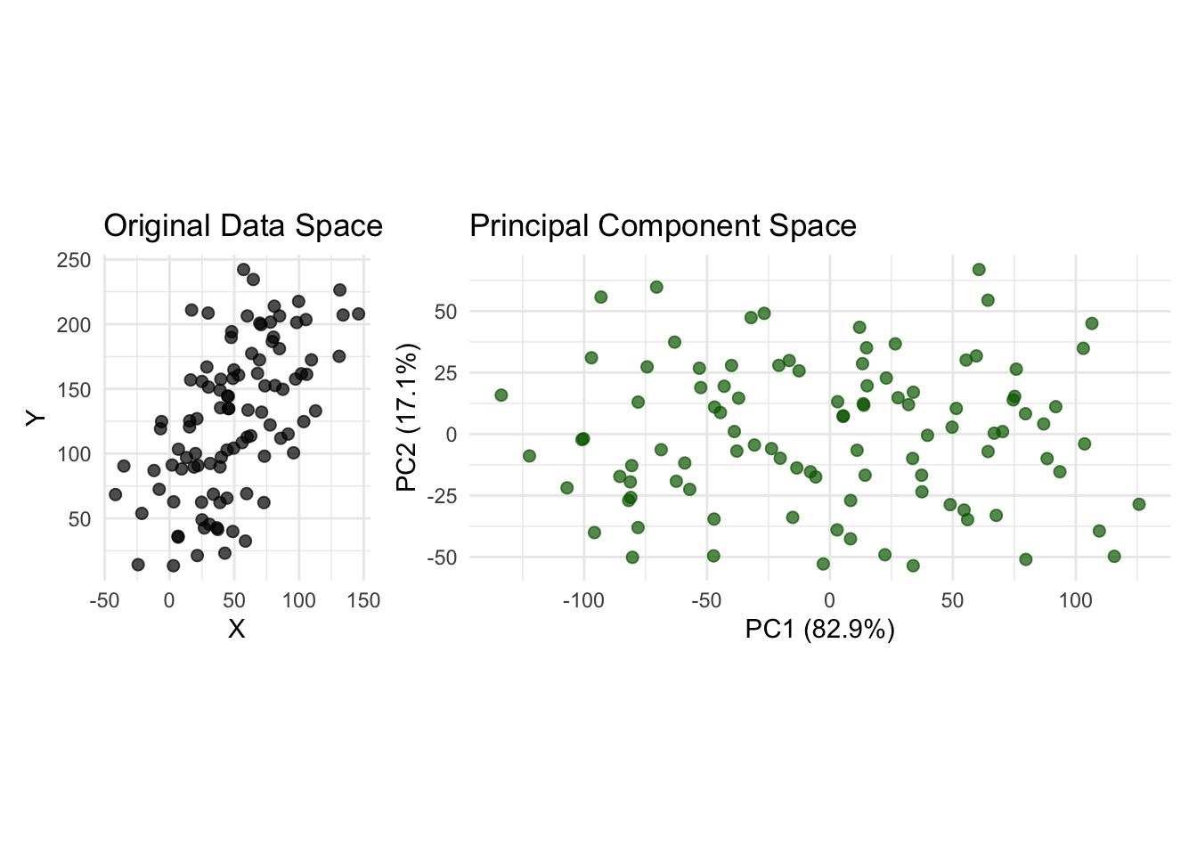
Step 7: Comparison - Original vs Principal Component Space
Let’s compare the original data with the transformed data side by side:
# Side by side comparisonp_original <-ggplot(data_original, aes(x = x, y = y)) +geom_point(alpha =0.7, size =2, color ="black") +labs(title ="Original Data Space",x ="X", y ="Y") +theme_minimal() +coord_fixed()p_transformed <-ggplot(data_pc_space, aes(x = PC1, y = PC2)) +geom_point(alpha =0.7, size =2, color ="darkgreen") +labs(title ="Principal Component Space",x =paste0("PC1 (", round(var_explained[1]*100, 1), "%)"), y =paste0("PC2 (", round(var_explained[2]*100, 1), "%)")) +theme_minimal() +coord_fixed()combined_plot <- p_original + p_transformedprint(combined_plot)
Verification with R’s prcomp()
Let’s verify our calculations using R’s built-in PCA function:
# Use prcomp for verificationpca_result <-prcomp(cbind(x_obs, y_obs), center =TRUE, scale =FALSE)print("Our eigenvalues vs prcomp standard deviations squared:")
[1] "Our eigenvalues vs prcomp standard deviations squared:"
---title: "Lecture 9: PCA Step by Step - Visual Understanding"author: "DH302"format: htmleditor: visual---```{r setup}library(tidyverse)library(patchwork)set.seed(2) # Generate synthetic data with correlationx <-1:100ex <-rnorm(100, 0, 25) # gaussian blob for xey <-rnorm(100, 0, 25) # gaussian blob for yy <-25+2* x # y is linearly related to xx_obs <- x + ex # add noise to xy_obs <- y + ey # add noise to y# Create data frame for plottingdata_original <-data.frame(x = x_obs,y = y_obs,type ="Original Data")ggplot(data_original, aes(x,y)) +geom_point()```## Step 1: Original Data with Center PointLet's first look at our raw data and identify the center (mean) point:```{r step1-original-data}# Calculate center pointcenter_x <-mean(x_obs)center_y <-mean(y_obs)p1 <-ggplot(data_original, aes(x = x, y = y)) +geom_point(alpha =0.7, size =2, color ="black") +geom_point(aes(x = center_x, y = center_y), color ="red", size =4, shape =19) +labs(title ="Step 1: Original Data with Center Point",subtitle =paste0("Center: (", round(center_x, 1), ", ", round(center_y, 1), ")"),x ="X values", y ="Y values") +theme_minimal() +coord_fixed() +theme(plot.title =element_text(face ="bold"))p1```## Step 2: Center the DataPCA requires centered data (mean = 0). Let's subtract the mean from each variable:```{r step2-centered-data}# Center the dataM <-cbind(x_obs - center_x, y_obs - center_y)colnames(M) <-c("x_centered", "y_centered")data_centered <-data.frame(x = M[, 1],y = M[, 2],type ="Centered Data")p2 <-ggplot(data_centered, aes(x = x, y = y)) +geom_point(alpha =0.7, size =2, color ="blue") +geom_point(aes(x =0, y =0), color ="red", size =4, shape =19) +geom_hline(yintercept =0, linetype ="dashed", alpha =0.5) +geom_vline(xintercept =0, linetype ="dashed", alpha =0.5) +labs(title ="Step 2: Centered Data",subtitle ="Data now centered at origin (0,0)",x ="X centered", y ="Y centered") +theme_minimal() +coord_fixed() +theme(plot.title =element_text(face ="bold"))p2```## Step 3: Calculate Covariance Matrix and EigenanalysisNow we compute the covariance matrix and find its eigenvalues and eigenvectors:```{r step3-covariance-eigen}# Calculate covariance matrixMCov <-cov(M)print("Covariance Matrix:")print(round(MCov, 2))# Compute eigenvalues and eigenvectorseigen_result <-eigen(MCov)eigenValues <- eigen_result$valueseigenVectors <- eigen_result$vectors# Alternatively we can calcucate svd of the original central matrixd <-svd(M)$d # singular valuesv <-svd(M)$v # right singular values# Calculate proportion of variance explainedvar_explained <- eigenValues /sum(eigenValues)print("Proportion of variance explained by each PC:")print(paste("PC1:", round(var_explained[1] *100, 1), "%"))print(paste("PC2:", round(var_explained[2] *100, 1), "%"))# Show that eigeValues of MCov and singular vlaues of M are sameprint(sum(eigenValues-d))# Show that eigenVectors of MCov and right singular vlaues of M are sameprint(sum(eigenVectors-v))```## Step 4: Visualize Principal Component DirectionsLet's add the principal component axes to our centered data:```{r step4-pc-axes}# Create lines for principal components# PC1 direction (first eigenvector)pc1_slope <- eigenVectors[2, 1] / eigenVectors[1, 1]# PC2 direction (second eigenvector) pc2_slope <- eigenVectors[2, 2] / eigenVectors[1, 2]# Create line segments for visualizationline_length <-50# Extend lines in both directions# PC1 line pointspc1_x <-c(-line_length, line_length)pc1_y <- pc1_slope * pc1_x# PC2 line points pc2_x <-c(-line_length, line_length)pc2_y <- pc2_slope * pc2_x# Plot with principal component axesp3 <-ggplot(data_centered, aes(x = x, y = y)) +geom_point(alpha =0.7, size =2, color ="blue") +geom_point(aes(x =0, y =0), color ="red", size =4, shape =19) +geom_line(data =data.frame(x = pc1_x, y = pc1_y), aes(x = x, y = y), color ="green", size =1.2, alpha =0.8) +geom_line(data =data.frame(x = pc2_x, y = pc2_y), aes(x = x, y = y), color ="orange", size =1.2, alpha =0.8) +geom_hline(yintercept =0, linetype ="dashed", alpha =0.3) +geom_vline(xintercept =0, linetype ="dashed", alpha =0.3) +labs(title ="Step 4: Principal Component Axes",subtitle ="Green = PC1 (max variance), Orange = PC2 (orthogonal)",x ="X centered", y ="Y centered") +theme_minimal() +coord_fixed(xlim =c(-80, 80), ylim =c(-80, 80)) +theme(plot.title =element_text(face ="bold"))p3print(paste("PC1 explains", round(var_explained[1] *100, 1), "% of variance"))print(paste("PC2 explains", round(var_explained[2] *100, 1), "% of variance"))```## Step 5: Project Data onto First Principal Component```{r step5-projections}# Project data onto first principal component# Projection formula: (M · v1) * v1pc1_vector <- eigenVectors[, 1]projections_pc1 <- (M %*% pc1_vector) %*%t(pc1_vector)# Create data frame with original points and projectionsdata_with_projections <-data.frame(x_orig = M[, 1],y_orig = M[, 2],x_proj = projections_pc1[, 1],y_proj = projections_pc1[, 2])# Plot with projectionsp4 <-ggplot() +# Original pointsgeom_point(data = data_with_projections, aes(x = x_orig, y = y_orig), alpha =0.7, size =2, color ="blue") +# Projected pointsgeom_point(data = data_with_projections, aes(x = x_proj, y = y_proj), color ="purple", size =2, alpha =0.8) +# Connection linesgeom_segment(data = data_with_projections,aes(x = x_orig, y = y_orig, xend = x_proj, yend = y_proj),color ="purple", alpha =0.5, linetype ="dashed") +# Principal component axesgeom_line(data =data.frame(x = pc1_x, y = pc1_y), aes(x = x, y = y), color ="green", size =1.2, alpha =0.8) +geom_line(data =data.frame(x = pc2_x, y = pc2_y), aes(x = x, y = y), color ="orange", size =1.2, alpha =0.8) +geom_point(aes(x =0, y =0), color ="red", size =4, shape =19) +labs(title ="Step 5: Projections onto First Principal Component",subtitle ="Purple dots = projections, dashed lines = distance to PC1",x ="X centered", y ="Y centered") +theme_minimal() +coord_fixed(xlim =c(-80, 80), ylim =c(-80, 80)) +theme(plot.title =element_text(face ="bold"))print(p4)```## Step 6: Transform to Principal Component CoordinatesFinally, let's transform our data to the principal component coordinate system:```{r step6-transformed-coordinates}# Transform data to PC coordinates# PC scores = M * eigenvectorspc_scores <- M %*% eigenVectorscolnames(pc_scores) <-c("PC1", "PC2")# Create data frame for PC spacedata_pc_space <-data.frame(PC1 = pc_scores[, 1],PC2 = pc_scores[, 2])# Plot in PC coordinate systemp5 <-ggplot(data_pc_space, aes(x = PC1, y = PC2)) +geom_point(alpha =0.7, size =2, color ="darkgreen") +geom_point(aes(x =0, y =0), color ="red", size =4, shape =19) +geom_hline(yintercept =0, linetype ="dashed", alpha =0.5) +geom_vline(xintercept =0, linetype ="dashed", alpha =0.5) +labs(title ="Step 6: Data in Principal Component Space",subtitle =paste0("PC1 (", round(var_explained[1]*100, 1), "% var) vs PC2 (", round(var_explained[2]*100, 1), "% var)"),x =paste0("PC1 (", round(var_explained[1]*100, 1), "% of variance)"), y =paste0("PC2 (", round(var_explained[2]*100, 1), "% of variance)")) +theme_minimal() +coord_fixed() +theme(plot.title =element_text(face ="bold"))print(p5)print("Standard deviations of principal components:")print(paste("PC1:", round(sqrt(eigenValues[1]), 2)))print(paste("PC2:", round(sqrt(eigenValues[2]), 2)))```## Step 7: Comparison - Original vs Principal Component SpaceLet's compare the original data with the transformed data side by side:```{r step7-comparison}# Side by side comparisonp_original <-ggplot(data_original, aes(x = x, y = y)) +geom_point(alpha =0.7, size =2, color ="black") +labs(title ="Original Data Space",x ="X", y ="Y") +theme_minimal() +coord_fixed()p_transformed <-ggplot(data_pc_space, aes(x = PC1, y = PC2)) +geom_point(alpha =0.7, size =2, color ="darkgreen") +labs(title ="Principal Component Space",x =paste0("PC1 (", round(var_explained[1]*100, 1), "%)"), y =paste0("PC2 (", round(var_explained[2]*100, 1), "%)")) +theme_minimal() +coord_fixed()combined_plot <- p_original + p_transformedprint(combined_plot)```## Verification with R's prcomp()Let's verify our calculations using R's built-in PCA function:```{r verification}# Use prcomp for verificationpca_result <-prcomp(cbind(x_obs, y_obs), center =TRUE, scale =FALSE)print("Our eigenvalues vs prcomp standard deviations squared:")print(data.frame(Our_eigenvalues =round(eigenValues, 4),prcomp_sdev_squared =round(pca_result$sdev^2, 4),Difference =round(abs(eigenValues - pca_result$sdev^2), 6)))print("Our PC scores vs prcomp scores (first 5 rows):")our_scores <- pc_scores[1:5, ]prcomp_scores <- pca_result$x[1:5, ]print("Our scores:")print(round(our_scores, 4))print("prcomp scores:") print(round(prcomp_scores, 4))```##