Imagine you’re developing a diagnostic panel to detect cancer. You’ve identified 500 genes that might be associated with cancer risk. Your task: determine which genes are truly associated with cancer vs. which associations are just due to chance.
To do this, you: 1. Measure expression levels of all 500 genes in cancer patients vs. healthy controls 2. Perform a statistical test (like a t-test) for each gene to see if expression differs between groups 3.
When you perform one statistical test with α = 0.05, you accept a 5% chance of a false positive (Type I error).
When you perform 500 independent tests, all with α = 0.05:
\[\text{Probability of at least one false positive} = 1 - (1 - 0.05)^{500}\]
You are almost guaranteed to find false positives!
Why does this happen?
If you flip a fair coin 5 times expecting all heads, the probability is low: (0.5)^5 = 3.1%. But if you flip 500 coins each once, how many will be heads just by chance? About 250!
In our gene panel: - We have 500 “coins” (genes) - We flip each once (perform one test per gene) - At α = 0.05, we expect 500 × 0.05 = 25 false positives just from random chance
Similarly, when we test 500 genes and find 30 genes with p-value < 0.05. At expected value, ~25 of these are false positives - Only ~5 might be truly associated with cancer
So publishing all 30 genes would mean: - 83% false discovery rate (25 false positives out of 30). Patients tested on these genes get misleading results. Everyone wastes time studying false leads.
This is the multiple testing problem.
library(ggplot2)library(dplyr)
Attaching package: 'dplyr'
The following objects are masked from 'package:stats':

    filter, lag
The following objects are masked from 'package:base':

    intersect, setdiff, setequal, union
library(tidyr)# Set seed for reproducibilityset.seed(42)mytheme <-theme_minimal() +theme(plot.title =element_text(size =14, face ="bold"),plot.subtitle =element_text(size =11, color ="gray40"),axis.title =element_text(size =11),legend.position ="top" )
Visualising the problem
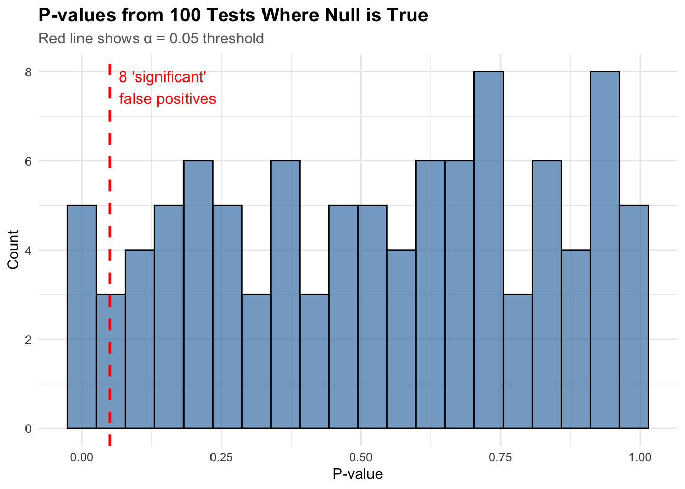
Let’s simulate what happens when we test 100 hypotheses where none are actually true (all null hypotheses are true):
n_tests <-100p_values <-runif(n_tests, 0, 1) # Under null, p-values are uniformly distributed# Count "significant" results at alpha = 0.05n_significant <-sum(p_values <0.05)# Create histogramhist_data <-data.frame(p_value = p_values)ggplot(hist_data, aes(x = p_value)) +geom_histogram(bins =20, fill ="steelblue", alpha =0.7, color ="black") +geom_vline(xintercept =0.05, color ="red", linetype ="dashed", linewidth =1) +annotate("text",x =0.05, y =Inf,label =paste0(n_significant, " 'significant' \nfalse positives"),hjust =-0.1, vjust =1.5, color ="red", size =4 ) +labs(title ="P-values from 100 Tests Where Null is True",subtitle ="Red line shows α = 0.05 threshold",x ="P-value",y ="Count" ) + mytheme
We found 8 “significant” results even though nothing was real! This is the problem we need to solve.
But again, what is the problem?
When we do multiple tests, we need to think about different types of errors:
Family-Wise Error Rate (FWER): The probability of making even one false positive. Like saying “I want zero mistakes” –> Very conservative - protects you strongly but may miss real discoveries. Bonferroni correction controls FWER.
False Discovery Rate (FDR): Among all discoveries you make, what proportion are false? Like saying “I’m okay if 5% of my findings are false positives” –> More flexible - lets you find more real effects while controlling false positives. Benjamini-Hochberg controls FDR
An intuitive analogy
Imagine you’re running a cancer diagnostic clinic and you’ve developed a panel of 500 genetic markers. You use it to screen patients:
Without Multiple testing correction
“We’ll flag anyone with abnormal markers as high-risk” - You flag 30 patients as having cancer risk - But 25 of them are actually fine (false alarms) - Result: 83% of your “positive” diagnoses are wrong - Patients get unnecessary anxiety, costly treatments, wrong decisions
FWER - Bonferroni (Ultra-Conservative)
“We want to be 95% certain we don’t mis-diagnose ANY patient” - You only flag patients with the clearest, most obvious markers - You correctly identify 3 patients with real cancer risk - BUT you miss 27 patients who actually have cancer risk (false negatives) - Result: Everyone you flag is definitely high-risk, but you let many sick patients walk out thinking they’re fine
FDR - Benjamini-Hochberg (balanced)
“We’re okay if 5% of our high-risk diagnoses turn out to be false” - You flag 8 patients as high-risk - You expect about 0.4 of them to ultimately be false alarms (5% of 8) - Result: You catch more real cases (8 vs 3), but accept that roughly 1 in 20 “high-risk” calls might be wrong - These 8 patients get further testing—some are confirmed, a few aren’t—but no major harm done
Summary
Bonferroni = Assuming your screening test is terrible at ruling out false alarms, so you only act on the most obvious cases
FDR = Accepting that some of your calls will be wrong (5%), but since you’re following up with confirmatory testing anyway, it’s fine—you catch more real cases
In a clinic, you’d never use Bonferroni alone because you’d miss too much cancer. You’d use FDR for the initial panel, then confirm with follow-up tests.
The Benjamini-Hochberg procedure
The Benjamini-Hochberg (BH) method is surprisingly simple and elegant. Here’s how it works:
The algorithm
Sort all p-values from smallest to largest
Number them: i = 1, 2, 3, …, m (where m is total number of tests)
Calculate threshold for each test: (i/m) × α (where α is your desired FDR, usually 0.05)
Find the largest i where: p-value ≤ (i/m) × α
Reject all hypotheses from 1 to i
Let’s see this using a demo:
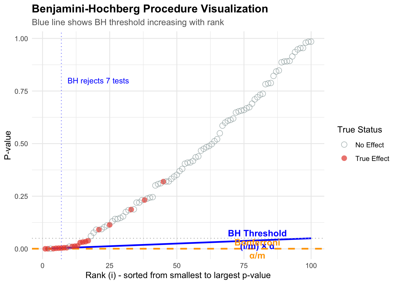
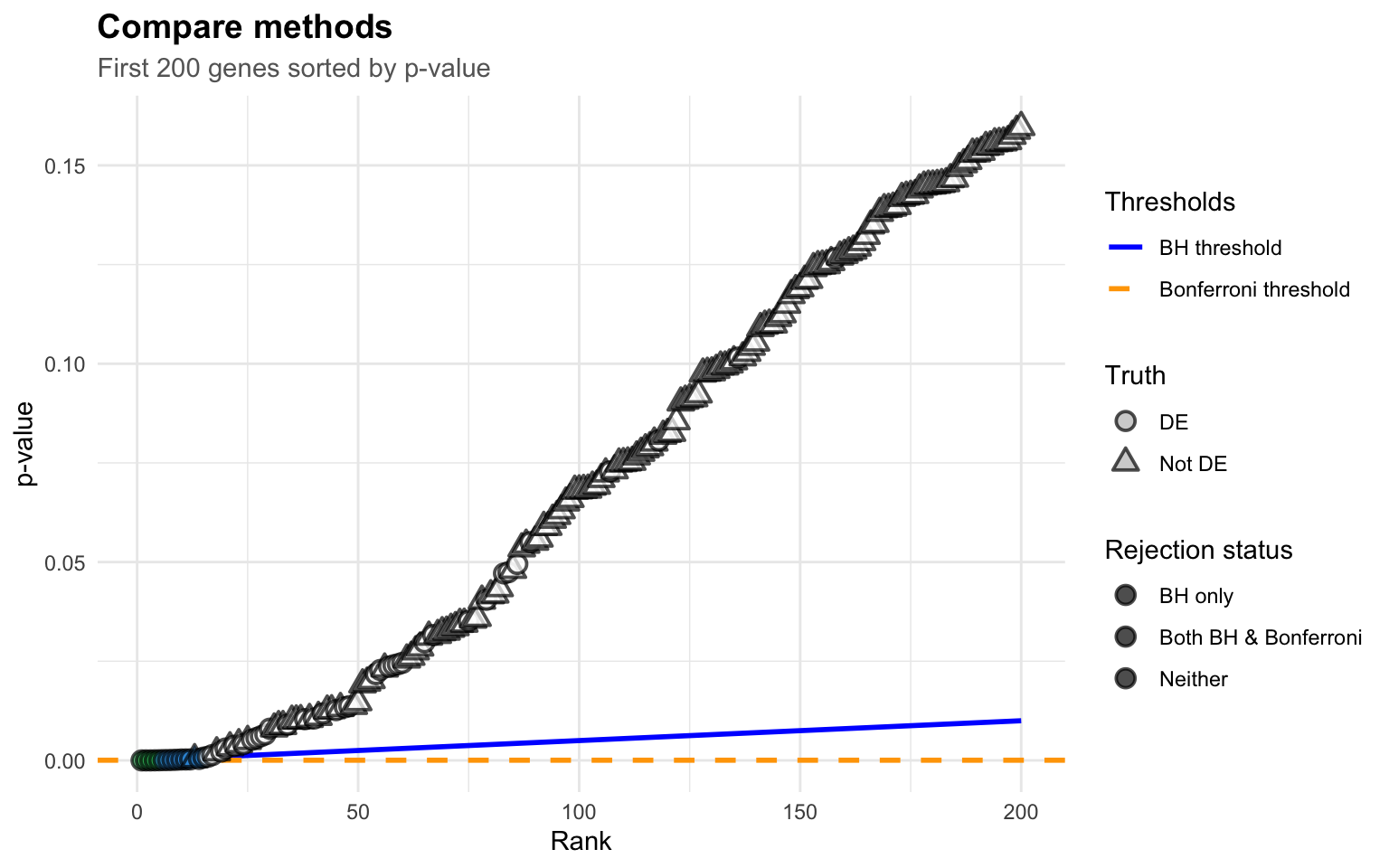
# Simulate a more realistic scenario: 100 tests, 20 are truly significantset.seed(123)n_tests <-100n_true <-20n_null <- n_tests - n_true# Generate p-values# True alternatives: small p-values (from exponential distribution)p_true <-rbeta(n_true, 0.5, 10)# True nulls: uniform p-valuesp_null <-runif(n_null, 0, 1)# Combine and create datasetp_values <-c(p_true, p_null)true_status <-c(rep("True Effect", n_true), rep("No Effect", n_null))test_data <-data.frame(test_id =1:n_tests,p_value = p_values,truth = true_status) %>%arrange(p_value) %>%mutate(rank =row_number(),bh_threshold = (rank / n_tests) *0.05,bonf_threshold =0.05/ n_tests,significant_bh = p_value <= bh_threshold,significant_bonf = p_value <= bonf_threshold )# Find the BH cutoffbh_cutoff <-max(which(test_data$significant_bh))# Create the visualizationggplot(test_data, aes(x = rank, y = p_value)) +# BH threshold linegeom_line(aes(y = bh_threshold), color ="blue", linewidth =1, linetype ="solid") +# Bonferroni threshold linegeom_hline(yintercept =0.05/ n_tests, color ="orange", linewidth =1, linetype ="dashed") +# Alpha linegeom_hline(yintercept =0.05, color ="gray", linewidth =0.5, linetype ="dotted") +# Points colored by truthgeom_point(aes(color = truth, shape = truth), size =3, alpha =0.7) +# Highlight the BH cutoffgeom_vline(xintercept = bh_cutoff, color ="blue", linetype ="dotted", alpha =0.5) +# Annotationsannotate("text",x =80, y =0.045, label ="BH Threshold\n(i/m) × α",color ="blue", size =4, fontface ="bold" ) +annotate("text",x =80, y =0.0005, label ="Bonferroni\nα/m",color ="orange", size =4, fontface ="bold" ) +annotate("text",x = bh_cutoff, y =0.8,label =paste0("BH rejects ", bh_cutoff, " tests"),color ="blue", hjust =-0.1, size =3.5 ) +scale_color_manual(values =c("True Effect"="#E74C3C", "No Effect"="#95A5A6")) +scale_shape_manual(values =c("True Effect"=16, "No Effect"=1)) +labs(title ="Benjamini-Hochberg Procedure Visualization",subtitle ="Blue line shows BH threshold increasing with rank",x ="Rank (i) - sorted from smallest to largest p-value",y ="P-value",color ="True Status",shape ="True Status" ) + mytheme +theme(legend.position ="right")
What’s happening here?
The blue line is the BH threshold: it starts small and gradually increases. This is the key insight!
Small p-values (left side): Easy to reject –> the threshold is low but so are the p-values
Larger p-values (right side): Threshold increases, allowing more discoveries
The magic: BH finds the largest rank where p-value still crosses below the line
Notice how: - Benjamini-Hochberg found 5 significant tests - Bonferroni only found 2 significant tests - The truth: 20 tests actually have real effects
BH gives us more power to detect real effects while still controlling false discoveries!
Why does this work?
The genius of BH is in the increasing threshold. Here’s why it works:
The ranking creates protection
True effects tend to have small p-values → They cluster on the left
False positives are randomly scattered → They’re spread throughout
By sorting p-values, we naturally group most true effects together
The increasing threshold allows us to be more lenient as we move right, where we’re less likely to find true effects anyway
Visual intuition
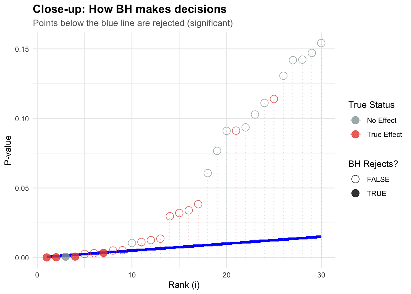
# Zoom in on the first 30 testszoom_data <- test_data %>%filter(rank <=30)ggplot(zoom_data, aes(x = rank, y = p_value)) +# Step function showing BH decisiongeom_step(aes(y = bh_threshold), color ="blue", linewidth =1.5, direction ="mid") +geom_point(aes(color = truth, shape = significant_bh), size =4, alpha =0.8) +geom_segment(aes(x = rank, xend = rank, y =0, yend = p_value, color = truth),alpha =0.3, linetype ="dotted" ) +scale_color_manual(values =c("True Effect"="#E74C3C", "No Effect"="#95A5A6")) +scale_shape_manual(values =c("TRUE"=19, "FALSE"=1),guide =guide_legend(title ="BH Rejects?") ) +labs(title ="Close-up: How BH makes decisions",subtitle ="Points below the blue line are rejected (significant)",x ="Rank (i)",y ="P-value",color ="True Status" ) + mytheme +theme(legend.position ="right")
Think of it like climbing a staircase: - You keep climbing (accepting tests as significant) - As long as p-values stay below the rising threshold - Once a p-value exceeds the threshold, you stop
The mathematical intuition
You don’t need heavy math to understand why BH works, but a little intuition helps!
Why the (i/m) × α formula?
The BH procedure uses the threshold: p(i) ≤ (i/m) × α
Let’s break down what each part means:
i = the rank of this p-value (1st smallest, 2nd smallest, etc.)
m = total number of tests
α = your target FDR (e.g., 0.05)
The intuition: As you accept more tests (increasing i), you’re allowed a slightly more lenient threshold. Why? Because:
True effects cluster at small p-values - they naturally rank early
The ratio i/m grows slowly - you’re not being too generous
The method “spends” your error budget across all tests efficiently
Example
Suppose you have 10 tests and want FDR = 0.05:
i <-1:10m <-10alpha <-0.05threshold <- (i / m) * alphamath_example <-data.frame(Rank_i = i,`i/m`= i / m,`Threshold (i/m)×0.05`= threshold,`Interpretation`=c("1st test: very strict","2nd test: slight relaxation","3rd test: more lenient","4th test: continuing to grow","5th test: halfway point","6th test: getting lenient","7th test: fairly relaxed","8th test: quite lenient","9th test: very lenient","10th test: same as unadjusted!" ))knitr::kable(math_example[1:5, ],digits =4,col.names =c("Rank (i)", "i/m", "Threshold", "What this means"),caption ="BH threshold calculation (first 5 tests)")
BH threshold calculation (first 5 tests)
Rank (i)
i/m
Threshold
What this means
1
0.1
0.005
1st test: very strict
2
0.2
0.010
2nd test: slight relaxation
3
0.3
0.015
3rd test: more lenient
4
0.4
0.020
4th test: continuing to grow
5
0.5
0.025
5th test: halfway point
Notice: - Rank 1: Threshold = 0.005 (very strict, like Bonferroni: 0.05/10) - Rank 5: Threshold = 0.025 (halfway to α) - Rank 10: Threshold = 0.050 (same as unadjusted!)
The increasing threshold is the key innovation!
Why does this control FDR?
The mathematical proof is complex, but here’s the intuitive idea:
Setup: Suppose you have m₀ true null hypotheses (no effect) and m₁ true alternatives (real effects).
Under the nulls: P-values are uniformly distributed between 0 and 1.
The clever part: When you sort all p-values together, the true nulls are “diluted” by the true alternatives (which have small p-values). By using the increasing threshold (i/m) × α, the procedure:
Mostly rejects true alternatives early (they have small p-values)
Occasionally accepts a null by mistake (but this is bounded!)
The math shows: On average, ≤ α × (m₀/m) ≤ α fraction of discoveries are false
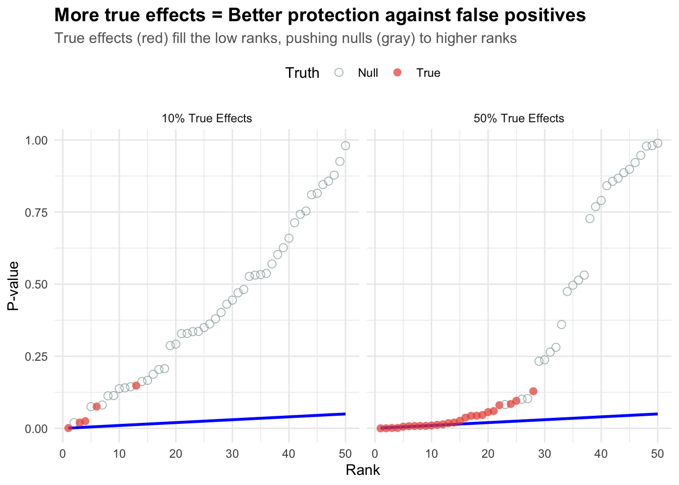
Key insight: The more true effects you have, the better BH performs (true alternatives “protect” against false positives by filling up the low ranks).
When there are many true effects (right panel), they dominate the low ranks, making it harder for false positives (nulls) to sneak in. This is why BH becomes more efficient when there are more real effects!
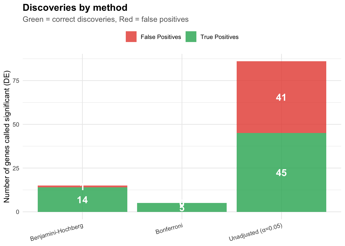
Example: Gene expression analysis
Let’s walk through a realistic example with gene expression data.